|
|
转自 http://xoomer.virgilio.it/infinity77/Phoenix/lib.agw.customtreectrl.CustomTreeCtrl.html这个网址中有许多控件的讲解
CustomTreeCtrl is a class that mimics the behaviour of TreeCtrl, with almost the same base functionalities plus some more enhancements. This class does not rely on the native control, as it is a full owner-drawn tree control.
 Inheritance Diagram
Inheritance diagram for class CustomTreeCtrl

 Control Appearance
 wxMSW
wxMSW
 wxMAC
wxMAC
 wxGTK
wxGTK
 Known Superclasses
PyScrolledWindow
 Methods Summary
| __init__ | Default class constructor. | | AcceptsFocus | Can this window be given focus by mouse click? | | AddRoot | Adds a root item to the CustomTreeCtrl. | | AdjustMyScrollbars | Internal method used to adjust the PyScrolledWindow scrollbars. | | AppendItem | Appends an item as a last child of its parent. | | AppendSeparator | Appends an horizontal line separator as a last child of its parent. | | AssignButtonsImageList | Assigns the button image list. | | AssignImageList | Assigns the normal image list. | | AssignLeftImageList | Assigns the image list for CustomTreeCtrl filled with images to be used on | | AssignStateImageList | Assigns the state image list. | | AutoCheckChild | Transverses the tree and checks/unchecks the items. | | AutoCheckParent | Traverses up the tree and checks/unchecks parent items. | | AutoToggleChild | Transverses the tree and toggles the items. | | CalculateLevel | Calculates the level of an item inside the tree hierarchy. | | CalculateLineHeight | Calculates the height of a line. | | CalculatePositions | Calculates all the positions of the visible items. | | CalculateSize | Calculates overall position and size of an item. | | CheckChilds | Programatically check/uncheck item children. | | CheckItem | Actually checks/uncheks an item, sending (eventually) the two | | CheckItem2 | Used internally to avoid EVT_TREE_ITEM_CHECKED events. | | CheckSameLevel | Uncheck radio items which are on the same level of the checked one. | | ChildrenClosing | We are about to destroy the item children. | | Collapse | Collapse an item, sending a EVT_TREE_ITEM_COLLAPSING and | | CollapseAndReset | Collapse the given item and deletes its children. | | Delete | Deletes an item. | | DeleteAllItems | Deletes all items in the CustomTreeCtrl. | | DeleteChildren | Delete all the item’s children. | | DeleteItemWindow | Deletes the window associated to an item (if any). | | DoGetBestSize | Gets the size which best suits the window: for a control, it would be the | | DoInsertItem | Actually inserts an item in the tree. | | DoSelectItem | Actually selects/unselects an item, sending EVT_TREE_SEL_CHANGING and | | DrawHorizontalGradient | Gradient fill from colour 1 to colour 2 from left to right. | | DrawVerticalGradient | Gradient fill from colour 1 to colour 2 from top to bottom. | | DrawVistaRectangle | Draws the selected item(s) with the Windows Vista style. | | Edit | Internal function. Starts the editing of an item label, sending a | | EditLabel | Starts editing an item label. | | EnableChildren | Enables/disables the item children. | | EnableItem | Enables/disables an item. | | EnableSelectionGradient | Globally enables/disables drawing of gradient selections. | | EnableSelectionVista | Globally enables/disables drawing of Windows Vista selections. | | EnsureVisible | Scrolls and/or expands items to ensure that the given item is visible. | | Expand | Expands an item, sending a EVT_TREE_ITEM_EXPANDING and | | ExpandAll | Expands all CustomTreeCtrl items. | | ExpandAllChildren | Expands all the items children of the input item. | | FillArray | Internal function. Used to populate an array of selected items when | | FindItem | Finds the first item starting with the given prefix after the given parent. | | Freeze | Freeze CustomTreeCtrl. | | GetAGWWindowStyleFlag | Returns the CustomTreeCtrl style. | | GetBackgroundImage | Returns the CustomTreeCtrl background image (if any). | | GetBorderPen | Returns the pen used to draw the selected item border. | | GetBoundingRect | Retrieves the rectangle bounding the item. | | GetButtonsImageList | Returns the buttons image list associated with CustomTreeCtrl (from | | GetChildrenCount | Returns the item children count. | | GetClassDefaultAttributes | Returns the default font and colours which are used by the control. This is | | GetConnectionPen | Returns the pen used to draw the connecting lines between items. | | GetControlBmp | Returns a native looking checkbox or radio button bitmap. | | GetCount | Returns the global number of items in the tree. | | GetDisabledColour | Returns the colour for items in a disabled state. | | GetEditControl | Returns a pointer to the edit TreeTextCtrl if the item is being edited or | | GetFirstChild | Returns the item’s first child and an integer value ‘cookie’. | | GetFirstGradientColour | Returns the first gradient colour for gradient-style selections. | | GetFirstVisibleItem | Returns the first visible item. | | GetGradientStyle | Returns the gradient style for gradient-style selections. | | GetHilightFocusColour | Returns the colour used to highlight focused selected items. | | GetHilightNonFocusColour | Returns the colour used to highlight unfocused selected items. | | GetHyperTextFont | Returns the font used to render hypertext items. | | GetHyperTextNewColour | Returns the colour used to render a non-visited hypertext item. | | GetHyperTextVisitedColour | Returns the colour used to render a visited hypertext item. | | GetImageList | Returns the normal image list associated with CustomTreeCtrl. | | GetImageListCheck | Returns the image list used to build the check/radio buttons in CustomTreeCtrl. | | GetIndent | Returns the item indentation, in pixels. | | GetItem3StateValue | Gets the state of a 3-state checkbox item. | | GetItemBackgroundColour | Returns the item background colour. | | GetItemFont | Returns the item font. | | GetItemImage | Returns the item image. | | GetItemLeftImage | Returns the item leftmost image, i.e. the image associated to the item on the leftmost | | GetItemParent | Returns the item parent (can be None for root items). | | GetItemSize | Returns the horizontal space available in CustomTreeCtrl, in pixels, to draw this item. | | GetItemText | Returns the item text. | | GetItemTextColour | Returns the item text colour or separator horizontal line colour. | | GetItemType | Returns the item type. | | GetItemVisited | Returns whether an hypertext item was visited. | | GetItemWindow | Returns the window associated to the item (if any). | | GetItemWindowEnabled | Returns whether the window associated to the item is enabled. | | GetLastChild | Returns the item last child. | | GetLeftImageList | Returns the image list for CustomTreeCtrl filled with images to be used on | | GetLineHeight | Returns the line height for the given item. | | GetMaxWidth | Returns the maximum width of the CustomTreeCtrl. | | GetNext | Returns the next item. Only for internal use right now. | | GetNextActiveItem | Returns the next active item. Used Internally at present. | | GetNextChild | Returns the item’s next child. | | GetNextExpanded | Returns the next expanded item after the input one. | | GetNextSibling | Returns the next sibling of an item. | | GetNextVisible | Returns the next visible item. | | GetPrev | Returns the previous item. Only for internal use right now. | | GetPrevExpanded | Returns the previous expanded item before the input one. | | GetPrevSibling | Returns the previous sibling of an item. | | GetPrevVisible | Returns the previous visible item. | | GetPyData | Returns the data associated to an item. | | GetRootItem | Returns the root item, an instance of GenericTreeItem. | | GetSecondGradientColour | Returns the second gradient colour for gradient-style selections. | | GetSelection | Returns the current selection. | | GetSelections | Returns a list of selected items. | | GetSeparatorColour | Returns the pen colour for separator-type items. | | GetSpacing | Returns the spacing between the start and the text, in pixels. | | GetStateImageList | Returns the state image list associated with CustomTreeCtrl (from which | | HandleHyperLink | Handles the hyperlink items, sending the EVT_TREE_ITEM_HYPERLINK event. | | HasAGWFlag | Returns True if CustomTreeCtrl has the flag bit set. | | HasButtons | Returns whether CustomTreeCtrl has the TR_HAS_BUTTONS flag set. | | HasChildren | Returns whether an item has children or not. | | HideWindows | Hides the windows associated to the items. Used internally. | | HitTest | Calculates which (if any) item is under the given point, returning the tree item | | InsertItem | Inserts an item after the given previous. | | InsertItemByIndex | Inserts an item after the given previous. | | InsertItemByItem | Inserts an item after the given previous. | | InsertSeparator | Inserts a separator item after the given previous. | | IsBold | Returns whether the item font is bold or not. | | IsDescendantOf | Checks if the given item is under another one in the tree hierarchy. | | IsExpanded | Returns whether the item is expanded or not. | | IsItalic | Returns whether the item font is italic or not. | | IsItem3State | Returns whether or not the checkbox item is a 3-state checkbox. | | IsItemChecked | Returns whether an item is checked or not. | | IsItemEnabled | Returns whether an item is enabled or disabled. | | IsItemHyperText | Returns whether an item is hypertext or not. | | IsItemSeparator | Returns whether an item is of separator type or not. | | IsSelected | Returns whether the item is selected or not. | | IsVisible | Returns whether the item is visible or not (i.e., its hierarchy is expanded | | ItemHasChildren | Returns whether the item has children or not. | | OnAcceptEdit | Called by TreeTextCtrl, to accept the changes and to send the | | OnCancelEdit | Called by TreeTextCtrl, to cancel the changes and to send the | | OnCompareItems | Returns whether 2 items have the same text. | | OnDestroy | Handles the EVT_WINDOW_DESTROY event for CustomTreeCtrl. | | OnEditTimer | The timer for editing has expired. Start editing. | | OnEraseBackground | Handles the EVT_ERASE_BACKGROUND event for CustomTreeCtrl. | | OnGetToolTip | Process the tooltip event, to speed up event processing. Does not actually | | OnInternalIdle | This method is normally only used internally, but sometimes an application | | OnKeyDown | Handles the EVT_KEY_DOWN event for CustomTreeCtrl, sending a | | OnKillFocus | Handles the EVT_KILL_FOCUS event for CustomTreeCtrl. | | OnMouse | Handles a bunch of EVT_MOUSE_EVENTS events for CustomTreeCtrl. | | OnPaint | Handles the EVT_PAINT event for CustomTreeCtrl. | | OnSetFocus | Handles the EVT_SET_FOCUS event for CustomTreeCtrl. | | OnSize | Handles the EVT_SIZE event for CustomTreeCtrl. | | PaintItem | Actually draws an item. | | PaintLevel | Paint a level in the hierarchy of CustomTreeCtrl. | | PrependItem | Prepends an item as a first child of parent. | | PrependSeparator | Prepends a separator item as a first child of parent. | | RecurseOnChildren | Recurses over all the children of the spcified items, calculating their | | RefreshItemWithWindows | Refreshes the items with which a window is associated. | | RefreshLine | Refreshes a damaged item line. | | RefreshSelected | Refreshes a damaged selected item line. | | RefreshSelectedUnder | Refreshes the selected items under the given item. | | RefreshSubtree | Refreshes a damaged subtree of an item. | | ResetEditControl | Called by TreeTextCtrl when it marks itself for deletion. | | ScrollTo | Scrolls the specified item into view. | | SelectAll | Selects all the item in the tree. | | SelectAllChildren | Selects all the children of the given item. | | SelectItem | Selects/deselects an item. | | SelectItemRange | Selects all the items between item1 and item2. | | SendDeleteEvent | Actually sends the EVT_TREE_DELETE_ITEM event. | | SetAGWWindowStyleFlag | Sets the CustomTreeCtrl window style. | | SetBackgroundColour | Changes the background colour of CustomTreeCtrl. | | SetBackgroundImage | Sets the CustomTreeCtrl background image. | | SetBorderPen | Sets the pen used to draw the selected item border. | | SetButtonsImageList | Sets the buttons image list for CustomTreeCtrl (from which application-defined | | SetConnectionPen | Sets the pen used to draw the connecting lines between items. | | SetDisabledColour | Sets the colour for items in a disabled state. | | SetFirstGradientColour | Sets the first gradient colour for gradient-style selections. | | SetFont | Sets the CustomTreeCtrl font. | | SetForegroundColour | Changes the foreground colour of CustomTreeCtrl. | | SetGradientStyle | Sets the gradient style for gradient-style selections. | | SetHilightFocusColour | Sets the colour used to highlight focused selected items. | | SetHilightNonFocusColour | Sets the colour used to highlight unfocused selected items. | | SetHyperTextFont | Sets the font used to render hypertext items. | | SetHyperTextNewColour | Sets the colour used to render a non-visited hypertext item. | | SetHyperTextVisitedColour | Sets the colour used to render a visited hypertext item. | | SetImageList | Sets the normal image list for CustomTreeCtrl. | | SetImageListCheck | Sets the checkbox/radiobutton image list. | | SetIndent | Sets the indentation for CustomTreeCtrl. | | SetItem3State | Sets whether the item has a 3-state value checkbox assigned to it or not. | | SetItem3StateValue | Sets the checkbox item to the given state. | | SetItemBackgroundColour | Sets the item background colour. | | SetItemBold | Sets the item font as bold/unbold. | | SetItemDropHighlight | Gives the item the visual feedback for drag and drop operations. | | SetItemFont | Sets the item font. | | SetItemHasChildren | Forces the appearance/disappearance of the button next to the item. | | SetItemHyperText | Sets whether the item is hypertext or not. | | SetItemImage | Sets the item image, depending on the item state. | | SetItemItalic | Sets the item font as italic/non-italic. | | SetItemLeftImage | Sets the item leftmost image, i.e. the image associated to the item on the leftmost | | SetItemText | Sets the item text. | | SetItemTextColour | Sets the item text colour or separator horizontal line colour. | | SetItemType | Sets the item type. | | SetItemVisited | Sets whether an hypertext item was visited. | | SetItemWindow | Sets the window for the given item. | | SetItemWindowEnabled | Enables/disables the window associated to the item. | | SetLeftImageList | Sets the image list for CustomTreeCtrl filled with images to be used on | | SetPyData | Sets the data associated to an item. | | SetSecondGradientColour | Sets the second gradient colour for gradient-style selections. | | SetSeparatorColour | Sets the pen colour for separator-type items. | | SetSpacing | Sets the spacing between items in CustomTreeCtrl. | | SetStateImageList | Sets the state image list for CustomTreeCtrl (from which application-defined | | ShouldInheritColours | Return True from here to allow the colours of this window to be | | SortChildren | Sorts the children of the given item using the OnCompareItems method of | | TagAllChildrenUntilLast | Used internally. | | TagNextChildren | Used internally. | | Thaw | Thaw CustomTreeCtrl. | | TileBackground | Tiles the background image to fill all the available area. | | Toggle | Toggles the item state (collapsed/expanded). | | ToggleItemSelection | Toggles the item selection. | | UnCheckRadioParent | Used internally to handle radio node parent correctly. | | Unselect | Unselects the current selection. | | UnselectAll | Unselect all the items. | | UnselectAllChildren | Unselects all the children of the given item. |
 Class API
class CustomTreeCtrl(PyScrolledWindow) CustomTreeCtrl is a class that mimics the behaviour of TreeCtrl, with almost the same base functionalities plus some more enhancements. This class does not rely on the native control, as it is a full owner-drawn tree control.
Methods
__init__(self, parent, id=ID_ANY, pos=DefaultPosition, size=DefaultSize, style=0, agwStyle=TR_DEFAULT_STYLE, validator=DefaultValidator, name="CustomTreeCtrl") Default class constructor.
Parameters:
- parent (Window) – parent window. Must not be None;
- id (integer) – window identifier. A value of -1 indicates a default value;
- pos (tuple or Point) – the control position. A value of (-1, -1) indicates a default position, chosen by either the windowing system or wxPython, depending on platform;
- size (tuple or Size) – the control size. A value of (-1, -1) indicates a default size, chosen by either the windowing system or wxPython, depending on platform;
- style (integer) – the underlying PyScrolledWindow style;
- agwStyle (integer) – the AGW-specific window style for CustomTreeCtrl. It can be a combination of the following bits:Window StylesHex ValueDescriptionTR_NO_BUTTONS0x0For convenience to document that no buttons are to be drawn.TR_SINGLE0x0For convenience to document that only one item may be selected at a time. Selecting another item causes the current selection, if any, to be deselected. This is the default.TR_HAS_BUTTONS0x1Use this style to show + and - buttons to the left of parent items.TR_NO_LINES0x4Use this style to hide vertical level connectors.TR_LINES_AT_ROOT0x8Use this style to show lines between root nodes. Only applicable if TR_HIDE_ROOT is set and TR_NO_LINES is not set.TR_DEFAULT_STYLE0x9The set of flags that are closest to the defaults for the native control for a particular toolkit.TR_TWIST_BUTTONS0x10Use old Mac-twist style buttons.TR_MULTIPLE0x20Use this style to allow a range of items to be selected. If a second range is selected, the current range, if any, is deselected.TR_EXTENDED0x40Use this style to allow disjoint items to be selected. (Only partially implemented; may not work in all cases).TR_HAS_VARIABLE_ROW_HEIGHT0x80Use this style to cause row heights to be just big enough to fit the content. If not set, all rows use the largest row height. The default is that this flag is unset.TR_EDIT_LABELS0x200Use this style if you wish the user to be able to edit labels in the tree control.TR_ROW_LINES0x400Use this style to draw a contrasting border between displayed rows.TR_HIDE_ROOT0x800Use this style to suppress the display of the root node, effectively causing the first-level nodes to appear as a series of root nodes.TR_FULL_ROW_HIGHLIGHT0x2000Use this style to have the background colour and the selection highlight extend over the entire horizontal row of the tree control window.TR_AUTO_CHECK_CHILD0x4000Only meaningful foe checkbox-type items: when a parent item is checked/unchecked its children are checked/unchecked as well.TR_AUTO_TOGGLE_CHILD0x8000Only meaningful foe checkbox-type items: when a parent item is checked/unchecked its children are toggled accordingly.TR_AUTO_CHECK_PARENT0x10000Only meaningful foe checkbox-type items: when a child item is checked/unchecked its parent item is checked/unchecked as well.TR_ALIGN_WINDOWS0x20000Flag used to align windows (in items with windows) at the same horizontal position.TR_ALIGN_WINDOWS_RIGHT0x40000Flag used to align windows (in items with windows) to the rightmost edge of CustomTreeCtrl.TR_ELLIPSIZE_LONG_ITEMS0x80000Flag used to ellipsize long items when the horizontal space for CustomTreeCtrl is low.TR_TOOLTIP_ON_LONG_ITEMS0x100000Flag used to show tooltips on long items when the horizontal space for CustomTreeCtrl is low.
- validator (Validator) – window validator;
- name (string) – window name.
AcceptsFocus(self) Can this window be given focus by mouse click?
Note
This method always returns True as we always accept focus from mouse click.
Note
Overridden from PyScrolledWindow.
AddRoot(self, text, ct_type=0, wnd=None, image=-1, selImage=-1, data=None) Adds a root item to the CustomTreeCtrl.
Parameters:
- text (string) – the item text label;
- ct_type (integer) – the item type (see SetItemType for a list of valid item types);
- wnd – if not None, a non-toplevel window to show next to the item, any subclass of Window except top-level windows;
- image (integer) – an index within the normal image list specifying the image to use for the item in unselected state;
- selImage (integer) – an index within the normal image list specifying the image to use for the item in selected state; if image > -1 and selImage is -1, the same image is used for both selected and unselected items;
- data (object) – associate the given Python object data with the item.
Returns:An instance of GenericTreeItem upon successful insertion.
Raise :Exception in the following cases:
- There already is a root item in the tree;
- The item window is not None but the TR_HAS_VARIABLE_ROW_HEIGHT flag has not been set for CustomTreeCtrl;
- The item has multiline text (with line-breaks in it) but the TR_HAS_VARIABLE_ROW_HEIGHT flag has not been set for CustomTreeCtrl;
- The ct_type attribute is less than 0 or greater than 2.
Warning
Only one root is allowed to exist in any given instance of CustomTreeCtrl.
AdjustMyScrollbars(self) Internal method used to adjust the PyScrolledWindow scrollbars.
AppendItem(self, parentId, text, ct_type=0, wnd=None, image=-1, selImage=-1, data=None) Appends an item as a last child of its parent.
Parameters:
- parentId – an instance of GenericTreeItem representing the item’s parent;
- text (string) – the item text label;
- ct_type (integer) – the item type (see SetItemType for a list of valid item types);
- wnd – if not None, a non-toplevel window to show next to the item, any subclass of Window;
- image (integer) – an index within the normal image list specifying the image to use for the item in unselected state;
- selImage (integer) – an index within the normal image list specifying the image to use for the item in selected state; if image > -1 and selImage is -1, the same image is used for both selected and unselected items;
- data (object) – associate the given Python object data with the item.
Returns:An instance of GenericTreeItem upon successful insertion.
See also
DoInsertItem for possible exceptions generated by this method.
AppendSeparator(self, parentId) Appends an horizontal line separator as a last child of its parent.
Parameters:parentId – an instance of GenericTreeItem representing the separator’s parent.Returns:An instance of GenericTreeItem upon successful insertion.
See also
DoInsertItem for possible exceptions generated by this method.
AssignButtonsImageList(self, imageList) Assigns the button image list.
Parameters:imageList – an instance of ImageList.
AssignImageList(self, imageList) Assigns the normal image list.
Parameters:imageList – an instance of ImageList.
AssignLeftImageList(self, imageList) Assigns the image list for CustomTreeCtrl filled with images to be used on the leftmost part of the client area. Any item can have a leftmost image associated with it.
Parameters:imageList – an instance of ImageList.
AssignStateImageList(self, imageList) Assigns the state image list.
Parameters:imageList – an instance of ImageList.
AutoCheckChild(self, item, checked) Transverses the tree and checks/unchecks the items.
Parameters:
- item – an instance of GenericTreeItem;
- checked (bool) – True to check an item, False to uncheck it.
Note
This method is meaningful only for checkbox-like and radiobutton-like items.
AutoCheckParent(self, item, checked) Traverses up the tree and checks/unchecks parent items.
Parameters:
- item – an instance of GenericTreeItem;
- checked (bool) – True to check an item, False to uncheck it.
Note
This method is meaningful only for checkbox-like and radiobutton-like items.
AutoToggleChild(self, item) Transverses the tree and toggles the items.
Parameters:item – an instance of GenericTreeItem.
Note
This method is meaningful only for checkbox-like and radiobutton-like items.
CalculateLevel(self, item, dc, level, y, align=0) Calculates the level of an item inside the tree hierarchy.
Parameters:
- item – an instance of GenericTreeItem;
- dc – an instance of DC;
- level (integer) – the item level in the tree hierarchy;
- y (integer) – the current vertical position inside the PyScrolledWindow;
- align (integer) – an integer specifying the alignment type:align ValueDescription0No horizontal alignment of windows (in items with windows).1Windows (in items with windows) are aligned at the same horizontal position.2Windows (in items with windows) are aligned at the rightmost edge ofCustomTreeCtrl.
Returns:The new y vertical position inside the PyScrolledWindow.
CalculateLineHeight(self) Calculates the height of a line.
CalculatePositions(self) Calculates all the positions of the visible items.
CalculateSize(self, item, dc, level=-1, align=0) Calculates overall position and size of an item.
Parameters:
- item – an instance of GenericTreeItem;
- dc – an instance of DC;
- level (integer) – the item level in the tree hierarchy;
- align (integer) – an integer specifying the alignment type:align ValueDescription0No horizontal alignment of windows (in items with windows).1Windows (in items with windows) are aligned at the same horizontal position.2Windows (in items with windows) are aligned at the rightmost edge ofCustomTreeCtrl.
CheckChilds(self, item, checked=True) Programatically check/uncheck item children.
Parameters:
- item – an instance of GenericTreeItem;
- checked (bool) – True to check an item, False to uncheck it.
Note
This method is meaningful only for checkbox-like and radiobutton-like items.
Note
This method does not generate EVT_TREE_ITEM_CHECKING and EVT_TREE_ITEM_CHECKED events.
CheckItem(self, item, checked=True) Actually checks/uncheks an item, sending (eventually) the two events EVT_TREE_ITEM_CHECKING and EVT_TREE_ITEM_CHECKED.
Parameters:
- item – an instance of GenericTreeItem;
- checked (bool) – for a radiobutton-type item, True to check it, False to uncheck it. For a checkbox-type item, it can be one of CHK_UNCHECKED when the checkbox is unchecked, CHK_CHECKED when it is checked and CHK_UNDETERMINED when it’s in the undetermined state.
CheckItem2(self, item, checked=True, torefresh=False) Used internally to avoid EVT_TREE_ITEM_CHECKED events.
Parameters:
- item – an instance of GenericTreeItem;
- checked (bool) – True to check an item, False to uncheck it;
- torefresh (bool) – whether to redraw the item or not.
CheckSameLevel(self, item, checked=False) Uncheck radio items which are on the same level of the checked one. Used internally.
Parameters:
- item – an instance of GenericTreeItem;
- checked (bool) – True to check an item, False to uncheck it.
Note
This method is meaningful only for radiobutton-like items.
ChildrenClosing(self, item) We are about to destroy the item children.
Parameters:item – an instance of GenericTreeItem.
Collapse(self, item) Collapse an item, sending a EVT_TREE_ITEM_COLLAPSING and EVT_TREE_ITEM_COLLAPSED events.
Parameters:item – an instance of GenericTreeItem.Raise :Exception if you try to collapse a hidden root (i.e., when the TR_HIDE_ROOT style is set for CustomTreeCtrl).
CollapseAndReset(self, item) Collapse the given item and deletes its children.
Parameters:item – an instance of GenericTreeItem.
Delete(self, item) Deletes an item.
Parameters:item – an instance of GenericTreeItem.
Note
This method sends the EVT_TREE_DELETE_ITEM event.
DeleteAllItems(self) Deletes all items in the CustomTreeCtrl.
DeleteChildren(self, item) Delete all the item’s children.
Parameters:item – an instance of GenericTreeItem.
DeleteItemWindow(self, item) Deletes the window associated to an item (if any).
Parameters:item – an instance of GenericTreeItem.
DoGetBestSize(self) Gets the size which best suits the window: for a control, it would be the minimal size which doesn’t truncate the control, for a panel - the same size as it would have after a call toFit().
Returns:An instance of Size.
Note
Overridden from PyScrolledWindow.
DoInsertItem(self, parentId, previous, text, ct_type=0, wnd=None, image=-1, selImage=-1, data=None, separator=False) Actually inserts an item in the tree.
Parameters:
- parentId – an instance of GenericTreeItem representing the item’s parent;
- previous (integer) – the index at which we should insert the item;
- text (string) – the item text label;
- ct_type (integer) – the item type (see SetItemType for a list of valid item types);
- wnd – if not None, a non-toplevel window to show next to the item, any subclass of Window except top-level windows;
- image (integer) – an index within the normal image list specifying the image to use for the item in unselected state;
- selImage (integer) – an index within the normal image list specifying the image to use for the item in selected state; if image > -1 and selImage is -1, the same image is used for both selected and unselected items;
- data (object) – associate the given Python object data with the item;
- separator (bool) – True if the item is a separator, False otherwise.
Returns:An instance of GenericTreeItem upon successful insertion.
Raise :Exception in the following cases:
- The item window is not None but the TR_HAS_VARIABLE_ROW_HEIGHT flag has not been set for CustomTreeCtrl;
- The item has multiline text (with line-breaks in it) but the TR_HAS_VARIABLE_ROW_HEIGHT flag has not been set for CustomTreeCtrl;
- The ct_type attribute is less than 0 or greater than 2;
- The parent item is a separator;
- The item is a separator but it has text or an associated window.
Note
Separator items should not have children, text labels or an associated window.
DoSelectItem(self, item, unselect_others=True, extended_select=False) Actually selects/unselects an item, sending EVT_TREE_SEL_CHANGING and EVT_TREE_SEL_CHANGED events.
Parameters:
- item – an instance of GenericTreeItem;
- unselect_others (bool) – if True, all the other selected items are unselected.
- extended_select (bool) – True if the CustomTreeCtrl is using the TR_EXTENDED style.
DrawHorizontalGradient(self, dc, rect, hasfocus) Gradient fill from colour 1 to colour 2 from left to right.
Parameters:
- dc – an instance of DC;
- rect (Rect) – the rectangle to be filled with the gradient shading;
- hasfocus (bool) – True if the main CustomTreeCtrl has focus, False otherwise.
DrawVerticalGradient(self, dc, rect, hasfocus) Gradient fill from colour 1 to colour 2 from top to bottom.
Parameters:
- dc – an instance of DC;
- rect (Rect) – the rectangle to be filled with the gradient shading;
- hasfocus (bool) – True if the main CustomTreeCtrl has focus, False otherwise.
DrawVistaRectangle(self, dc, rect, hasfocus) Draws the selected item(s) with the Windows Vista style.
Parameters:
- dc – an instance of DC;
- rect (Rect) – the rectangle to be filled with the gradient shading;
- hasfocus (bool) – True if the main CustomTreeCtrl has focus, False otherwise.
Edit(self, item) Internal function. Starts the editing of an item label, sending a EVT_TREE_BEGIN_LABEL_EDIT event.
Parameters:item – an instance of GenericTreeItem.
Warning
Separator-type items can not be edited.
EditLabel(self, item) Starts editing an item label.
Parameters:item – an instance of GenericTreeItem.
EnableChildren(self, item, enable=True) Enables/disables the item children.
Parameters:
- item – an instance of GenericTreeItem;
- enable (bool) – True to enable the children, False to disable them.
Note
This method is used internally.
EnableItem(self, item, enable=True, torefresh=True) Enables/disables an item.
Parameters:
- item – an instance of GenericTreeItem;
- enable (bool) – True to enable the item, False to disable it;
- torefresh (bool) – whether to redraw the item or not.
EnableSelectionGradient(self, enable=True) Globally enables/disables drawing of gradient selections.
Parameters:enable (bool) – True to enable gradient-style selections, False to disable it.
Note
Calling this method disables any Vista-style selection previously enabled.
EnableSelectionVista(self, enable=True) Globally enables/disables drawing of Windows Vista selections.
Parameters:enable (bool) – True to enable Vista-style selections, False to disable it.
Note
Calling this method disables any gradient-style selection previously enabled.
EnsureVisible(self, item) Scrolls and/or expands items to ensure that the given item is visible.
Parameters:item – an instance of GenericTreeItem.
Expand(self, item) Expands an item, sending a EVT_TREE_ITEM_EXPANDING and EVT_TREE_ITEM_EXPANDED events.
Parameters:item – an instance of GenericTreeItem.Raise :Exception if you try to expand a hidden root (i.e., when the TR_HIDE_ROOT style is set for CustomTreeCtrl).
ExpandAll(self) Expands all CustomTreeCtrl items.
Note
This method suppresses the EVT_TREE_ITEM_EXPANDING and EVT_TREE_ITEM_EXPANDED events because expanding many items int the control would be too slow then.
ExpandAllChildren(self, item) Expands all the items children of the input item.
Parameters:item – an instance of GenericTreeItem.
Note
This method suppresses the EVT_TREE_ITEM_EXPANDING and EVT_TREE_ITEM_EXPANDED events because expanding many items int the control would be too slow then.
FillArray(self, item, array=[]) Internal function. Used to populate an array of selected items when the style TR_MULTIPLE is used.
Parameters:
- item – an instance of GenericTreeItem;
- array (list) – a Python list containing the selected items.
Returns:A Python list containing the selected items.
FindItem(self, idParent, prefixOrig) Finds the first item starting with the given prefix after the given parent.
Parameters:
- idParent (integer) – an instance of GenericTreeItem;
- prefixOrig (string) – a string containing the item text prefix.
Returns:An instance of GenericTreeItem or None if no item has been found.
Freeze(self) Freeze CustomTreeCtrl.
Freezes the window or, in other words, prevents any updates from taking place on screen, the window is not redrawn at all. Thaw must be called to reenable window redrawing. Calls to these two functions may be nested.
Note
This method is useful for visual appearance optimization (for example, it is a good idea to use it before doing many large text insertions in a row into a TextCtrl under wxGTK) but is not implemented on all platforms nor for all controls so it is mostly just a hint to wxWidgets and not a mandatory directive.
GetAGWWindowStyleFlag(self) Returns the CustomTreeCtrl style.
See also
The __init__ method for a list of possible style flags.
GetBackgroundImage(self) Returns the CustomTreeCtrl background image (if any).
Returns:An instance of Bitmap if a background image is present, None otherwise.
Note
At present, the background image can only be used in “tile” mode.
Todo
Support background images also in stretch and centered modes.
GetBorderPen(self) Returns the pen used to draw the selected item border.
Returns:An instance of Pen.
Note
The border pen is not used if the Windows Vista selection style is applied.
GetBoundingRect(self, item, textOnly=False) Retrieves the rectangle bounding the item.
Parameters:
- item – an instance of GenericTreeItem;
- textOnly (bool) – if True, only the rectangle around the item’s label will be returned, otherwise the item’s image is also taken into account.
Returns:An instance of Rect.
Note
The rectangle coordinates are logical, not physical ones. So, for example, the x coordinate may be negative if the tree has a horizontal scrollbar and its position is not 0.
GetButtonsImageList(self) Returns the buttons image list associated with CustomTreeCtrl (from which application-defined button images are taken).
Returns:An instance of ImageList.
GetChildrenCount(self, item, recursively=True) Returns the item children count.
Parameters:
- item – an instance of GenericTreeItem;
- recursively (bool) – if True, returns the total number of descendants, otherwise only one level of children is counted.
classmethod GetClassDefaultAttributes(self) Returns the default font and colours which are used by the control. This is useful if you want to use the same font or colour in your own control as in a standard control – which is a much better idea than hard coding specific colours or fonts which might look completely out of place on the users system, especially if it uses themes.
This static method is “overridden’’ in many derived classes and so calling, for example, Button.GetClassDefaultAttributes () will typically return the values appropriate for a button which will be normally different from those returned by, say, ListCtrl.GetClassDefaultAttributes ().
Returns:An instance of VisualAttributes.
Note
The VisualAttributes structure has at least the fields font, colFg and colBg. All of them may be invalid if it was not possible to determine the default control appearance or, especially for the background colour, if the field doesn’t make sense as is the case for colBg for the controls with themed background.
Note
Overridden from PyControl.
GetConnectionPen(self) Returns the pen used to draw the connecting lines between items.
Returns:An instance of Pen.
GetControlBmp(self, checkbox=True, checked=False, enabled=True, x=16, y=16) Returns a native looking checkbox or radio button bitmap.
Parameters:
- checkbox (bool) – True to get a checkbox image, False for a radiobutton one;
- checked (bool) – True if the control is marked, False if it is not;
- enabled (bool) – True if the control is enabled, False if it is not;
- x (integer) – the width of the bitmap;
- y (integer) – the height of the bitmap.
Returns:An instance of Bitmap, representing a native looking checkbox or radiobutton.
GetCount(self) Returns the global number of items in the tree.
GetDisabledColour(self) Returns the colour for items in a disabled state.
Returns:An instance of Colour.
GetEditControl(self) Returns a pointer to the edit TreeTextCtrl if the item is being edited or None otherwise (it is assumed that no more than one item may be edited simultaneously).
GetFirstChild(self, item) Returns the item’s first child and an integer value ‘cookie’. Call GetNextChild for the next child using this very ‘cookie’ return value as an input.
Parameters:item – an instance of GenericTreeItem.Returns:A tuple with the first value being an instance of GenericTreeItem or None if there are no further children, and as second value an integer parameter ‘cookie’.
Note
This method returns None if there are no further children.
GetFirstGradientColour(self) Returns the first gradient colour for gradient-style selections.
Returns:An instance of Colour.
GetFirstVisibleItem(self) Returns the first visible item.
Returns:An instance of GenericTreeItem or None if there are no visible items.
GetGradientStyle(self) Returns the gradient style for gradient-style selections.
Returns:0 for horizontal gradient-style selections, 1 for vertical gradient-style selections.
GetHilightFocusColour(self) Returns the colour used to highlight focused selected items.
Returns:An instance of Colour.
Note
This is used only if gradient and Windows Vista selection styles are disabled.
GetHilightNonFocusColour(self) Returns the colour used to highlight unfocused selected items.
Returns:An instance of Colour.
Note
This is used only if gradient and Windows Vista selection styles are disabled.
GetHyperTextFont(self) Returns the font used to render hypertext items.
Returns:An instance of Font.
Note
This method is meaningful only for hypertext-like items.
GetHyperTextNewColour(self) Returns the colour used to render a non-visited hypertext item.
Returns:An instance of Colour.
Note
This method is meaningful only for hypertext-like items.
GetHyperTextVisitedColour(self) Returns the colour used to render a visited hypertext item.
Returns:An instance of Colour.
Note
This method is meaningful only for hypertext-like items.
GetImageList(self) Returns the normal image list associated with CustomTreeCtrl.
Returns:An instance of ImageList.
GetImageListCheck(self) Returns the image list used to build the check/radio buttons in CustomTreeCtrl.
Returns:An instance of ImageList.
GetIndent(self) Returns the item indentation, in pixels.
GetItem3StateValue(self, item) Gets the state of a 3-state checkbox item.
Parameters:item – an instance of GenericTreeItem.Returns:CHK_UNCHECKED when the checkbox is unchecked, CHK_CHECKED when it is checked and CHK_UNDETERMINED when it’s in the undetermined state.
Note
This method raises an exception when the function is used with a 2-state checkbox item.
Note
This method is meaningful only for checkbox-like items.
GetItemBackgroundColour(self, item) Returns the item background colour.
Parameters:item – an instance of GenericTreeItem.Returns:An instance of Colour.
GetItemFont(self, item) Returns the item font.
Parameters:item – an instance of GenericTreeItem.Returns:An instance of Font.
GetItemImage(self, item, which=TreeItemIcon_Normal) Returns the item image.
Parameters:
- item – an instance of GenericTreeItem;
- which (integer) – can be one of the following bits:Item StateDescriptionTreeItemIcon_NormalTo get the normal item imageTreeItemIcon_SelectedTo get the selected item image (i.e. the image which is shown when the item is currently selected)TreeItemIcon_ExpandedTo get the expanded image (this only makes sense for items which have children - then this image is shown when the item is expanded and the normal image is shown when it is collapsed)TreeItemIcon_SelectedExpandedTo get the selected expanded image (which is shown when an expanded item is currently selected)
Returns:An integer index that can be used to retrieve the item image inside a ImageList.
GetItemLeftImage(self, item) Returns the item leftmost image, i.e. the image associated to the item on the leftmost part of the CustomTreeCtrl client area.
Parameters:item – an instance of GenericTreeItem.Returns:An integer index that can be used to retrieve the item leftmost image inside a ImageList.
GetItemParent(self, item) Returns the item parent (can be None for root items).
Parameters:item – an instance of GenericTreeItem.Returns:An instance of GenericTreeItem or None for root items.
GetItemSize(self, item) Returns the horizontal space available in CustomTreeCtrl, in pixels, to draw this item.
Parameters:item – an instance of GenericTreeItem.New in version 0.9.3.
GetItemText(self, item) Returns the item text.
Parameters:item – an instance of GenericTreeItem.
GetItemTextColour(self, item) Returns the item text colour or separator horizontal line colour.
Parameters:item – an instance of GenericTreeItem.Returns:An instance of Colour.
GetItemType(self, item) Returns the item type.
Parameters:item – an instance of GenericTreeItem.Returns:An integer representing the item type.
See also
SetItemType for a description of valid item types.
GetItemVisited(self, item) Returns whether an hypertext item was visited.
Parameters:item – an instance of GenericTreeItem.Returns:True if the hypertext item has been visited, False otherwise.
Note
This method is meaningful only for hypertext-like items.
GetItemWindow(self, item) Returns the window associated to the item (if any).
Parameters:item – an instance of GenericTreeItem.Returns:An instance of Window if the item has an associated window, None otherwise.
GetItemWindowEnabled(self, item) Returns whether the window associated to the item is enabled.
Parameters:item – an instance of GenericTreeItem.Returns:True if the item has an associated window and this window is enabled, False in all other cases.
GetLastChild(self, item) Returns the item last child.
Parameters:item – an instance of GenericTreeItem.Returns:An instance of GenericTreeItem or None if there are no further children.
GetLeftImageList(self) Returns the image list for CustomTreeCtrl filled with images to be used on the leftmost part of the client area. Any item can have a leftmost image associated with it.
Returns:An instance of ImageList.
GetLineHeight(self, item) Returns the line height for the given item.
Parameters:item – an instance of GenericTreeItem.Returns:the item height, in pixels.
GetMaxWidth(self, respect_expansion_state=True) Returns the maximum width of the CustomTreeCtrl.
Parameters:respect_expansion_state (bool) – if True, only the expanded items (and their children) will be measured. Otherwise all the items are expanded and their width measured.Returns:the maximum width of CustomTreeCtrl, in pixels.
GetNext(self, item) Returns the next item. Only for internal use right now.
Returns:An instance of GenericTreeItem or None if there are no further items.Parameters:item – an instance of GenericTreeItem.
GetNextActiveItem(self, item, down=True) Returns the next active item. Used Internally at present.
Parameters:
- item – an instance of GenericTreeItem;
- down (bool) – True to search downwards in the hierarchy for an active item, False to search upwards.
Returns:An instance of GenericTreeItem if an active item has been found or None if none has been found.
GetNextChild(self, item, cookie) Returns the item’s next child.
Parameters:
- item – an instance of GenericTreeItem;
- cookie – a parameter which is opaque for the application but is necessary for the library to make these functions reentrant (i.e. allow more than one enumeration on one and the same object simultaneously).
Returns:A tuple with the first value being an instance of GenericTreeItem or None if there are no further children, and as second value an integer parameter ‘cookie’.
Note
This method returns None if there are no further children.
GetNextExpanded(self, item) Returns the next expanded item after the input one.
Parameters:item – an instance of TreeListItem.
GetNextSibling(self, item) Returns the next sibling of an item.
Parameters:item – an instance of GenericTreeItem.Returns:An instance of GenericTreeItem or None if there are no further siblings.
Note
This method returns None if there are no further siblings.
GetNextVisible(self, item) Returns the next visible item.
Parameters:item – an instance of GenericTreeItem.Returns:An instance of GenericTreeItem or None if there are no next visible items.
GetPrev(self, item) Returns the previous item. Only for internal use right now.
Parameters:item – an instance of GenericTreeItem.Returns:An instance of GenericTreeItem
GetPrevExpanded(self, item) Returns the previous expanded item before the input one.
Parameters:item – an instance of TreeListItem.
GetPrevSibling(self, item) Returns the previous sibling of an item.
Parameters:item – an instance of GenericTreeItem.Returns:An instance of GenericTreeItem or None if there are no further siblings.
Note
This method returns None if there are no further siblings.
GetPrevVisible(self, item) Returns the previous visible item.
Parameters:item – an instance of GenericTreeItem.Returns:An instance of GenericTreeItem or None if there are no previous visible items.
GetPyData(self, item) Returns the data associated to an item.
Parameters:item – an instance of GenericTreeItem.Returns:A Python object representing the item data, or None if no data has been assigned to this item.
GetRootItem(self) Returns the root item, an instance of GenericTreeItem.
GetSecondGradientColour(self) Returns the second gradient colour for gradient-style selections.
Returns:An instance of Colour.
GetSelection(self) Returns the current selection.
Returns:An instance of GenericTreeItem.
Note
This method is valid only with the style TR_SINGLE set. Use GetSelections for multiple-selections trees.
GetSelections(self) Returns a list of selected items.
Note
This method can be used only if CustomTreeCtrl has the TR_MULTIPLE or TR_EXTENDED style set.
Returns:A Python list containing the selected items, all instances of GenericTreeItem.
GetSeparatorColour(self, colour) Returns the pen colour for separator-type items.
Returns:An instance of Colour representing the separator pen colour.
GetSpacing(self) Returns the spacing between the start and the text, in pixels.
GetStateImageList(self) Returns the state image list associated with CustomTreeCtrl (from which application-defined state images are taken).
Returns:An instance of ImageList.
HandleHyperLink(self, item) Handles the hyperlink items, sending the EVT_TREE_ITEM_HYPERLINK event.
Parameters:item – an instance of GenericTreeItem.
HasAGWFlag(self, flag) Returns True if CustomTreeCtrl has the flag bit set.
Parameters:flag (integer) – any possible window style for CustomTreeCtrl.
See also
The __init__ method for the flag parameter description.
HasButtons(self) Returns whether CustomTreeCtrl has the TR_HAS_BUTTONS flag set.
Returns:True if CustomTreeCtrl has the TR_HAS_BUTTONS flag set, False otherwise.
HasChildren(self, item) Returns whether an item has children or not.
Parameters:item – an instance of GenericTreeItem.
HideWindows(self) Hides the windows associated to the items. Used internally.
HitTest(self, point, flags=0) Calculates which (if any) item is under the given point, returning the tree item at this point plus extra information flags.
Parameters:
- point – an instance of Point, a point to test for hits;
- flags (integer) – a bitlist of the following values:HitTest FlagsHex ValueDescriptionTREE_HITTEST_ABOVE0x1Above the client areaTREE_HITTEST_BELOW0x2Below the client areaTREE_HITTEST_NOWHERE0x4No item has been hitTREE_HITTEST_ONITEMBUTTON0x8On the button associated to an itemTREE_HITTEST_ONITEMICON0x10On the icon associated to an itemTREE_HITTEST_ONITEMINDENT0x20On the indent associated to an itemTREE_HITTEST_ONITEMLABEL0x40On the label (string) associated to an itemTREE_HITTEST_ONITEM0x50Anywhere on the itemTREE_HITTEST_ONITEMRIGHT0x80On the right of the label associated to an itemTREE_HITTEST_TOLEFT0x200On the left of the client areaTREE_HITTEST_TORIGHT0x400On the right of the client areaTREE_HITTEST_ONITEMUPPERPART0x800On the upper part (first half) of the itemTREE_HITTEST_ONITEMLOWERPART0x1000On the lower part (second half) of the itemTREE_HITTEST_ONITEMCHECKICON0x2000On the check/radio icon, if present
Returns:A tuple with the first value being an instance of GenericTreeItem or None if no item has been hit-tested, and as second value an integer parameter flag.
Note
both the item (if any, None otherwise) and the flags are always returned as a tuple.
InsertItem(self, parentId, input, text, ct_type=0, wnd=None, image=-1, selImage=-1, data=None, separator=False) Inserts an item after the given previous.
Returns:An instance of GenericTreeItem upon successful insertion.
See also
InsertItemByIndex and InsertItemByItem for an explanation of the input parameters.
See also
DoInsertItem for possible exceptions generated by this method.
InsertItemByIndex(self, parentId, idPrevious, text, ct_type=0, wnd=None, image=-1, selImage=-1, data=None, separator=False) Inserts an item after the given previous.
Parameters:
- parentId – an instance of GenericTreeItem representing the item’s parent;
- idPrevious – the index at which we should insert the new item;
- text (string) – the item text label;
- ct_type (integer) – the item type (see SetItemType for a list of valid item types);
- wnd – if not None, a non-toplevel window to show next to the item, any subclass of Window;
- image (integer) – an index within the normal image list specifying the image to use for the item in unselected state;
- selImage (integer) – an index within the normal image list specifying the image to use for the item in selected state; if image > -1 and selImage is -1, the same image is used for both selected and unselected items;
- data (object) – associate the given Python object data with the item;
- separator (bool) – True if the item is a separator, False otherwise.
Returns:An instance of GenericTreeItem upon successful insertion.
See also
DoInsertItem for possible exceptions generated by this method.
InsertItemByItem(self, parentId, idPrevious, text, ct_type=0, wnd=None, image=-1, selImage=-1, data=None, separator=False) Inserts an item after the given previous.
Parameters:
- parentId – an instance of GenericTreeItem representing the item’s parent;
- idPrevious – an instance of GenericTreeItem representing the previous item;
- text (string) – the item text label;
- ct_type (integer) – the item type (see SetItemType for a list of valid item types);
- wnd – if not None, a non-toplevel window to show next to the item, any subclass of Window;
- image (integer) – an index within the normal image list specifying the image to use for the item in unselected state;
- selImage (integer) – an index within the normal image list specifying the image to use for the item in selected state; if image > -1 and selImage is -1, the same image is used for both selected and unselected items;
- data (object) – associate the given Python object data with the item;
- separator (bool) – True if the item is a separator, False otherwise.
Returns:An instance of GenericTreeItem upon successful insertion.
Raise :Exception if the previous item is not a sibling.
See also
DoInsertItem for other possible exceptions generated by this method.
InsertSeparator(self, parentId, input) Inserts a separator item after the given previous.
Returns:An instance of GenericTreeItem upon successful insertion.
See also
InsertItemByIndex and InsertItemByItem for an explanation of the input parameters.
See also
DoInsertItem for possible exceptions generated by this method.
IsBold(self, item) Returns whether the item font is bold or not.
Parameters:item – an instance of GenericTreeItem.Returns:True if the item has bold text, False otherwise.
IsDescendantOf(self, parent, item) Checks if the given item is under another one in the tree hierarchy.
Parameters:
- parent – an instance of GenericTreeItem, representing the possible parent of item;
- item – another instance of GenericTreeItem.
Returns:True if item is a descendant of parent, False otherwise.
IsExpanded(self, item) Returns whether the item is expanded or not.
Parameters:item – an instance of GenericTreeItem.Returns:True if the item is expanded, False if it is collapsed.
IsItalic(self, item) Returns whether the item font is italic or not.
Parameters:item – an instance of GenericTreeItem.Returns:True if the item has italic text, False otherwise.
IsItem3State(self, item) Returns whether or not the checkbox item is a 3-state checkbox.
Parameters:item – an instance of GenericTreeItem.Returns:True if this checkbox is a 3-state checkbox, False if it’s a 2-state checkbox item.
Note
This method is meaningful only for checkbox-like items.
IsItemChecked(self, item) Returns whether an item is checked or not.
Parameters:item – an instance of GenericTreeItem.Returns:True if the item is in a ‘checked’ state, False otherwise.
Note
This method is meaningful only for checkbox-like and radiobutton-like items.
IsItemEnabled(self, item) Returns whether an item is enabled or disabled.
Parameters:item – an instance of GenericTreeItem.
IsItemHyperText(self, item) Returns whether an item is hypertext or not.
Parameters:item – an instance of GenericTreeItem.Returns:True if the item is hypertext-like, False otherwise.
IsItemSeparator(self, item) Returns whether an item is of separator type or not.
Parameters:item – an instance of GenericTreeItem.
IsSelected(self, item) Returns whether the item is selected or not.
Parameters:item – an instance of GenericTreeItem.Returns:True if the item is selected, False otherwise.
IsVisible(self, item) Returns whether the item is visible or not (i.e., its hierarchy is expanded enough to show the item).
Parameters:item – an instance of GenericTreeItem.Returns:True if the item is visible, False if it is hidden.
ItemHasChildren(self, item) Returns whether the item has children or not.
Parameters:item – an instance of GenericTreeItem.Returns:True if the item has children, False otherwise.
OnAcceptEdit(self, item, value) Called by TreeTextCtrl, to accept the changes and to send the EVT_TREE_END_LABEL_EDIT event.
Parameters:
- item – an instance of GenericTreeItem;
- value (string) – the new value of the item label.
Returns:True if the editing has not been vetoed, False otherwise.
OnCancelEdit(self, item) Called by TreeTextCtrl, to cancel the changes and to send the EVT_TREE_END_LABEL_EDIT event.
Parameters:item – an instance of GenericTreeItem.
OnCompareItems(self, item1, item2) Returns whether 2 items have the same text.
Override this function in the derived class to change the sort order of the items in the CustomTreeCtrl. The function should return a negative, zero or positive value if the first item is less than, equal to or greater than the second one.
Parameters:
- item1 – an instance of GenericTreeItem;
- item2 – another instance of GenericTreeItem.
Returns:The return value is negative if item1 < item2, zero if item1 == item2 and strictly positive if item1 < item2.
Note
The base class version compares items alphabetically.
OnDestroy(self, event) Handles the EVT_WINDOW_DESTROY event for CustomTreeCtrl.
Parameters:event – a WindowDestroyEvent event to be processed.
OnEditTimer(self) The timer for editing has expired. Start editing.
OnEraseBackground(self, event) Handles the EVT_ERASE_BACKGROUND event for CustomTreeCtrl.
Parameters:event – a EraseEvent event to be processed.
OnGetToolTip(self, event) Process the tooltip event, to speed up event processing. Does not actually get a tooltip.
Parameters:event – a CommandTreeEvent event to be processed.
OnInternalIdle(self) This method is normally only used internally, but sometimes an application may need it to implement functionality that should not be disabled by an application defining an OnIdle handler in a derived class.
This method may be used to do delayed painting, for example, and most implementations call Window.UpdateWindowUI in order to send update events to the window in idle time.
OnKeyDown(self, event) Handles the EVT_KEY_DOWN event for CustomTreeCtrl, sending a EVT_TREE_KEY_DOWN event.
Parameters:event – a KeyEvent event to be processed.
OnKillFocus(self, event) Handles the EVT_KILL_FOCUS event for CustomTreeCtrl.
Parameters:event – a FocusEvent event to be processed.
OnMouse(self, event) Handles a bunch of EVT_MOUSE_EVENTS events for CustomTreeCtrl.
Parameters:event – a MouseEvent event to be processed.
OnPaint(self, event) Handles the EVT_PAINT event for CustomTreeCtrl.
Parameters:event – a PaintEvent event to be processed.
OnSetFocus(self, event) Handles the EVT_SET_FOCUS event for CustomTreeCtrl.
Parameters:event – a FocusEvent event to be processed.
OnSize(self, event) Handles the EVT_SIZE event for CustomTreeCtrl.
Parameters:event – a SizeEvent event to be processed.
PaintItem(self, item, dc, level, align) Actually draws an item.
Parameters:
- item – an instance of GenericTreeItem;
- dc – an instance of DC;
- level (integer) – the item level in the tree hierarchy;
- align (integer) – an integer specifying the alignment type:align ValueDescription0No horizontal alignment of windows (in items with windows).1Windows (in items with windows) are aligned at the same horizontal position.2Windows (in items with windows) are aligned at the rightmost edge ofCustomTreeCtrl.
PaintLevel(self, item, dc, level, y, align) Paint a level in the hierarchy of CustomTreeCtrl.
Parameters:
- item – an instance of GenericTreeItem;
- dc – an instance of DC;
- level (integer) – the item level in the tree hierarchy;
- y (integer) – the current vertical position in the PyScrolledWindow;
- align (integer) – an integer specifying the alignment type:align ValueDescription0No horizontal alignment of windows (in items with windows).1Windows (in items with windows) are aligned at the same horizontal position.2Windows (in items with windows) are aligned at the rightmost edge ofCustomTreeCtrl.
PrependItem(self, parent, text, ct_type=0, wnd=None, image=-1, selImage=-1, data=None, separator=False) Prepends an item as a first child of parent.
Parameters:
- parent – an instance of GenericTreeItem representing the item’s parent;
- text (string) – the item text label;
- ct_type (integer) – the item type (see SetItemType for a list of valid item types);
- wnd – if not None, a non-toplevel window to show next to the item, any subclass of Window except top-level windows;
- image (integer) – an index within the normal image list specifying the image to use for the item in unselected state;
- selImage (integer) – an index within the normal image list specifying the image to use for the item in selected state; if image > -1 and selImage is -1, the same image is used for both selected and unselected items;
- data (object) – associate the given Python object data with the item;
- separator (bool) – True if the item is a separator, False otherwise.
Returns:An instance of GenericTreeItem upon successful insertion.
See also
DoInsertItem for possible exceptions generated by this method.
PrependSeparator(self, parent) Prepends a separator item as a first child of parent.
Parameters:parent – an instance of GenericTreeItem representing the item’s parent.Returns:An instance of GenericTreeItem upon successful insertion.
See also
DoInsertItem for possible exceptions generated by this method.
RecurseOnChildren(self, item, maxwidth, respect_expansion_state) Recurses over all the children of the spcified items, calculating their maximum width.
Parameters:
- item – an instance of GenericTreeItem;
- maxwidth (integer) – the current maximum width for CustomTreeCtrl, in pixels;
- respect_expansion_state (bool) – if True, only the expanded items (and their children) will be measured. Otherwise all the items are expanded and their width measured.
Returns:A tuple containing the maximum width and item height, in pixels.
RefreshItemWithWindows(self, item=None) Refreshes the items with which a window is associated.
Parameters:item – an instance of GenericTreeItem. If item is None, then the recursive refresh starts from the root node.
Note
This method is called only if the style TR_ALIGN_WINDOWS_RIGHT is used.
RefreshLine(self, item) Refreshes a damaged item line.
Parameters:item – an instance of GenericTreeItem.
RefreshSelected(self) Refreshes a damaged selected item line.
RefreshSelectedUnder(self, item) Refreshes the selected items under the given item.
Parameters:item – an instance of GenericTreeItem.
RefreshSubtree(self, item) Refreshes a damaged subtree of an item.
Parameters:item – an instance of GenericTreeItem.
ResetEditControl(self) Called by TreeTextCtrl when it marks itself for deletion.
ScrollTo(self, item) Scrolls the specified item into view.
Parameters:item – an instance of GenericTreeItem.
SelectAll(self) Selects all the item in the tree.
Raise :Exception if used without the TR_EXTENDED or TR_MULTIPLE style set.
Note
This method can be used only if CustomTreeCtrl has the TR_MULTIPLE or TR_EXTENDED style set.
SelectAllChildren(self, item) Selects all the children of the given item.
Parameters:item – an instance of GenericTreeItem.Raise :Exception if used without the TR_EXTENDED or TR_MULTIPLE style set.
Note
This method can be used only if CustomTreeCtrl has the TR_MULTIPLE or TR_EXTENDED style set.
SelectItem(self, item, select=True) Selects/deselects an item.
Parameters:
- item – an instance of GenericTreeItem;
- select (bool) – True to select an item, False to deselect it.
SelectItemRange(self, item1, item2) Selects all the items between item1 and item2.
Parameters:
- item1 – an instance of GenericTreeItem, representing the first item in the range to select;
- item2 – an instance of GenericTreeItem, representing the last item in the range to select.
Raise :Exception if used without the TR_EXTENDED or TR_MULTIPLE style set.
Note
This method can be used only if CustomTreeCtrl has the TR_MULTIPLE or TR_EXTENDED style set.
SendDeleteEvent(self, item) Actually sends the EVT_TREE_DELETE_ITEM event.
Parameters:item – an instance of GenericTreeItem.
SetAGWWindowStyleFlag(self, agwStyle) Sets the CustomTreeCtrl window style.
Parameters:agwStyle (integer) – the new CustomTreeCtrl window style.
See also
The __init__ method for the agwStyle parameter description.
SetBackgroundColour(self, colour) Changes the background colour of CustomTreeCtrl.
Parameters:colour – the colour to be used as the background colour, pass NullColour to reset to the default colour.Returns:False if the underlying PyScrolledWindow does not accept the new colour, True otherwise.
Note
The background colour is usually painted by the default EraseEvent event handler function under Windows and automatically under GTK.
Note
Setting the background colour does not cause an immediate refresh, so you may wish to call Window.ClearBackground or Window.Refresh after calling this function.
Note
Overridden from PyScrolledWindow.
SetBackgroundImage(self, image) Sets the CustomTreeCtrl background image.
Parameters:image – if not None, an instance of Bitmap.
Note
At present, the background image can only be used in “tile” mode.
Todo
Support background images also in stretch and centered modes.
SetBorderPen(self, pen) Sets the pen used to draw the selected item border.
Parameters:pen – an instance of Pen.
Note
The border pen is not used if the Windows Vista selection style is applied.
SetButtonsImageList(self, imageList) Sets the buttons image list for CustomTreeCtrl (from which application-defined button images are taken).
Parameters:imageList – an instance of ImageList.
SetConnectionPen(self, pen) Sets the pen used to draw the connecting lines between items.
Parameters:pen – an instance of Pen.
SetDisabledColour(self, colour) Sets the colour for items in a disabled state.
Parameters:colour – a valid Colour instance.
SetFirstGradientColour(self, colour=None) Sets the first gradient colour for gradient-style selections.
Parameters:colour – if not None, a valid Colour instance. Otherwise, the colour is taken from the system value SYS_COLOUR_HIGHLIGHT .
SetFont(self, font) Sets the CustomTreeCtrl font.
Parameters:font – a valid Font instance.
Note
Overridden from PyScrolledWindow.
SetForegroundColour(self, colour) Changes the foreground colour of CustomTreeCtrl.
Parameters:colour – the colour to be used as the foreground colour, pass NullColour to reset to the default colour.Returns:False if the underlying PyScrolledWindow does not accept the new colour, True otherwise.
Note
Overridden from PyScrolledWindow.
SetGradientStyle(self, vertical=0) Sets the gradient style for gradient-style selections.
Parameters:vertical (integer) – 0 for horizontal gradient-style selections, 1 for vertical gradient-style selections.
SetHilightFocusColour(self, colour) Sets the colour used to highlight focused selected items.
Parameters:colour – a valid Colour instance.
Note
This is applied only if gradient and Windows Vista selection styles are disabled.
SetHilightNonFocusColour(self, colour) Sets the colour used to highlight unfocused selected items.
Parameters:colour – a valid Colour instance.
Note
This is applied only if gradient and Windows Vista selection styles are disabled.
SetHyperTextFont(self, font) Sets the font used to render hypertext items.
Parameters:font – a valid Font instance.
Note
This method is meaningful only for hypertext-like items.
SetHyperTextNewColour(self, colour) Sets the colour used to render a non-visited hypertext item.
Parameters:colour – a valid Colour instance.
Note
This method is meaningful only for hypertext-like items.
SetHyperTextVisitedColour(self, colour) Sets the colour used to render a visited hypertext item.
Parameters:colour – a valid Colour instance.
Note
This method is meaningful only for hypertext-like items.
SetImageList(self, imageList) Sets the normal image list for CustomTreeCtrl.
Parameters:imageList – an instance of ImageList.
SetImageListCheck(self, sizex, sizey, imglist=None) Sets the checkbox/radiobutton image list.
Parameters:
- sizex (integer) – the width of the bitmaps in the imglist, in pixels;
- sizey (integer) – the height of the bitmaps in the imglist, in pixels;
- imglist – an instance of ImageList.
SetIndent(self, indent) Sets the indentation for CustomTreeCtrl.
Parameters:indent (integer) – an integer representing the indentation for the items in the tree.
SetItem3State(self, item, allow) Sets whether the item has a 3-state value checkbox assigned to it or not.
Parameters:
- item – an instance of GenericTreeItem;
- allow (bool) – True to set an item as a 3-state checkbox, False to set it to a 2-state checkbox.
Returns:True if the change was successful, False otherwise.
Note
This method is meaningful only for checkbox-like items.
SetItem3StateValue(self, item, state) Sets the checkbox item to the given state.
Parameters:
- item – an instance of GenericTreeItem;
- state (integer) – can be one of: CHK_UNCHECKED (check is off), CHK_CHECKED (check is on) or CHK_UNDETERMINED (check is mixed).
Note
This method raises an exception when the checkbox item is a 2-state checkbox and setting the state to CHK_UNDETERMINED .
Note
This method is meaningful only for checkbox-like items.
SetItemBackgroundColour(self, item, colour) Sets the item background colour.
Parameters:
- item – an instance of GenericTreeItem;
- colour – a valid Colour instance.
SetItemBold(self, item, bold=True) Sets the item font as bold/unbold.
Parameters:
- item – an instance of GenericTreeItem;
- bold (bool) – True to set the item font as bold, False otherwise.
SetItemDropHighlight(self, item, highlight=True) Gives the item the visual feedback for drag and drop operations. This is useful when something is dragged from outside the CustomTreeCtrl.
Parameters:
- item – an instance of GenericTreeItem;
- highlight (bool) – True to highlight the dragged items, False otherwise.
SetItemFont(self, item, font) Sets the item font.
Parameters:
- item – an instance of GenericTreeItem;
- font – a valid Font instance.
SetItemHasChildren(self, item, has=True) Forces the appearance/disappearance of the button next to the item.
Parameters:
- item – an instance of GenericTreeItem;
- has (bool) – True to have a button next to an item, False otherwise.
SetItemHyperText(self, item, hyper=True) Sets whether the item is hypertext or not.
Parameters:
- item – an instance of GenericTreeItem;
- hyper (bool) – True to have an item with hypertext behaviour, False otherwise.
SetItemImage(self, item, image, which=TreeItemIcon_Normal) Sets the item image, depending on the item state.
Parameters:
- item – an instance of GenericTreeItem;
- image (integer) – an index within the normal image list specifying the image to use for the item in the state specified by the which parameter;
- which (integer) – the item state.
See also
GetItemImage for an explanation of the which parameter.
SetItemItalic(self, item, italic=True) Sets the item font as italic/non-italic.
Parameters:
- item – an instance of GenericTreeItem;
- italic (bool) – True to set the item font as italic, False otherwise.
SetItemLeftImage(self, item, image) Sets the item leftmost image, i.e. the image associated to the item on the leftmost part of the CustomTreeCtrl client area.
Parameters:
- item – an instance of GenericTreeItem;
- image (integer) – an index within the left image list specifying the image to use for the item in the leftmost part of the client area.
SetItemText(self, item, text) Sets the item text.
Parameters:
- item – an instance of GenericTreeItem;
- text (string) – the new item label.
Raise :Exception if the input item is a separator.
SetItemTextColour(self, item, colour) Sets the item text colour or separator horizontal line colour.
Parameters:
- item – an instance of GenericTreeItem;
- colour – a valid Colour instance.
SetItemType(self, item, ct_type) Sets the item type.
Parameters:
- item – an instance of GenericTreeItem;
- ct_type (integer) – may be one of the following integers:ct_typeValueDescription0A normal item1A checkbox-like item2A radiobutton-type item
Note
Regarding radiobutton-type items (with ct_type = 2), the following approach is used:
- All peer-nodes that are radiobuttons will be mutually exclusive. In other words, only one of a set of radiobuttons that share a common parent can be checked at once. If a radiobutton node becomes checked, then all of its peer radiobuttons must be unchecked.
- If a radiobutton node becomes unchecked, then all of its child nodes will become inactive.
SetItemVisited(self, item, visited=True) Sets whether an hypertext item was visited.
Parameters:
- item – an instance of GenericTreeItem;
- visited (bool) – True to mark an hypertext item as visited, False otherwise.
Note
This method is meaningful only for hypertext-like items.
SetItemWindow(self, item, wnd) Sets the window for the given item.
Parameters:
- item – an instance of GenericTreeItem;
- wnd – if not None, a non-toplevel window to be displayed next to the item.
Raise :Exception if the input item is a separator and wnd is not None.
SetItemWindowEnabled(self, item, enable=True) Enables/disables the window associated to the item.
Parameters:
- item – an instance of GenericTreeItem;
- enable (bool) – True to enable the associated window, False to disable it.
SetLeftImageList(self, imageList) Sets the image list for CustomTreeCtrl filled with images to be used on the leftmost part of the client area. Any item can have a leftmost image associated with it.
Parameters:imageList – an instance of ImageList.
SetPyData(self, item, data) Sets the data associated to an item.
Parameters:
- item – an instance of GenericTreeItem;
- data (object) – can be any Python object.
SetSecondGradientColour(self, colour=None) Sets the second gradient colour for gradient-style selections.
Parameters:colour – if not None, a valid Colour instance. Otherwise, the colour generated is a slightly darker version of the CustomTreeCtrl background colour.
SetSeparatorColour(self, colour) Sets the pen colour for separator-type items.
Parameters:colour – a valid instance of Colour.
SetSpacing(self, spacing) Sets the spacing between items in CustomTreeCtrl.
Parameters:spacing (integer) – an integer representing the spacing between items in the tree.
SetStateImageList(self, imageList) Sets the state image list for CustomTreeCtrl (from which application-defined state images are taken).
Parameters:imageList – an instance of ImageList.
ShouldInheritColours(self) Return True from here to allow the colours of this window to be changed by InheritAttributes, returning False forbids inheriting them from the parent window.
The base class version returns False, but this method is overridden in Control where it returns True.
CustomTreeCtrl does not inherit colours from anyone.
SortChildren(self, item) Sorts the children of the given item using the OnCompareItems method of CustomTreeCtrl.
Parameters:item – an instance of GenericTreeItem.
Note
You should override the OnCompareItems method in your derived class to change the sort order (the default is ascending case-sensitive alphabetical order).
TagAllChildrenUntilLast(self, crt_item, last_item, select) Used internally.
TagNextChildren(self, crt_item, last_item, select) Used internally.
Thaw(self) Thaw CustomTreeCtrl.
Reenables window updating after a previous call to Freeze. To really thaw the control, it must be called exactly the same number of times as Freeze.
Raise :Exception if Thaw has been called without an un-matching Freeze.
TileBackground(self, dc) Tiles the background image to fill all the available area.
Parameters:dc – an instance of DC.
Todo
Support background images also in stretch and centered modes.
Toggle(self, item) Toggles the item state (collapsed/expanded).
Parameters:item – an instance of GenericTreeItem.
ToggleItemSelection(self, item) Toggles the item selection.
Parameters:item – an instance of GenericTreeItem.
UnCheckRadioParent(self, item, checked=False) Used internally to handle radio node parent correctly.
Parameters:
- item – an instance of GenericTreeItem;
- checked (bool) – True to check an item, False to uncheck it.
Unselect(self) Unselects the current selection.
UnselectAll(self) Unselect all the items.
UnselectAllChildren(self, item) Unselects all the children of the given item.
Parameters:item – an instance of GenericTreeItem. ---恢复内容结束---
CustomTreeCtrl is a class that mimics the behaviour of TreeCtrl, with almost the same base functionalities plus some more enhancements. This class does not rely on the native control, as it is a full owner-drawn tree control.
Inheritance Diagram
Inheritance diagram for class CustomTreeCtrl
Control Appearance
wxMSW
wxMAC
wxGTK
Known Superclasses
PyScrolledWindow
Methods Summary
| __init__ | Default class constructor. | | AcceptsFocus | Can this window be given focus by mouse click? | | AddRoot | Adds a root item to the CustomTreeCtrl. | | AdjustMyScrollbars | Internal method used to adjust the PyScrolledWindow scrollbars. | | AppendItem | Appends an item as a last child of its parent. | | AppendSeparator | Appends an horizontal line separator as a last child of its parent. | | AssignButtonsImageList | Assigns the button image list. | | AssignImageList | Assigns the normal image list. | | AssignLeftImageList | Assigns the image list for CustomTreeCtrl filled with images to be used on | | AssignStateImageList | Assigns the state image list. | | AutoCheckChild | Transverses the tree and checks/unchecks the items. | | AutoCheckParent | Traverses up the tree and checks/unchecks parent items. | | AutoToggleChild | Transverses the tree and toggles the items. | | CalculateLevel | Calculates the level of an item inside the tree hierarchy. | | CalculateLineHeight | Calculates the height of a line. | | CalculatePositions | Calculates all the positions of the visible items. | | CalculateSize | Calculates overall position and size of an item. | | CheckChilds | Programatically check/uncheck item children. | | CheckItem | Actually checks/uncheks an item, sending (eventually) the two | | CheckItem2 | Used internally to avoid EVT_TREE_ITEM_CHECKED events. | | CheckSameLevel | Uncheck radio items which are on the same level of the checked one. | | ChildrenClosing | We are about to destroy the item children. | | Collapse | Collapse an item, sending a EVT_TREE_ITEM_COLLAPSING and | | CollapseAndReset | Collapse the given item and deletes its children. | | Delete | Deletes an item. | | DeleteAllItems | Deletes all items in the CustomTreeCtrl. | | DeleteChildren | Delete all the item’s children. | | DeleteItemWindow | Deletes the window associated to an item (if any). | | DoGetBestSize | Gets the size which best suits the window: for a control, it would be the | | DoInsertItem | Actually inserts an item in the tree. | | DoSelectItem | Actually selects/unselects an item, sending EVT_TREE_SEL_CHANGING and | | DrawHorizontalGradient | Gradient fill from colour 1 to colour 2 from left to right. | | DrawVerticalGradient | Gradient fill from colour 1 to colour 2 from top to bottom. | | DrawVistaRectangle | Draws the selected item(s) with the Windows Vista style. | | Edit | Internal function. Starts the editing of an item label, sending a | | EditLabel | Starts editing an item label. | | EnableChildren | Enables/disables the item children. | | EnableItem | Enables/disables an item. | | EnableSelectionGradient | Globally enables/disables drawing of gradient selections. | | EnableSelectionVista | Globally enables/disables drawing of Windows Vista selections. | | EnsureVisible | Scrolls and/or expands items to ensure that the given item is visible. | | Expand | Expands an item, sending a EVT_TREE_ITEM_EXPANDING and | | ExpandAll | Expands all CustomTreeCtrl items. | | ExpandAllChildren | Expands all the items children of the input item. | | FillArray | Internal function. Used to populate an array of selected items when | | FindItem | Finds the first item starting with the given prefix after the given parent. | | Freeze | Freeze CustomTreeCtrl. | | GetAGWWindowStyleFlag | Returns the CustomTreeCtrl style. | | GetBackgroundImage | Returns the CustomTreeCtrl background image (if any). | | GetBorderPen | Returns the pen used to draw the selected item border. | | GetBoundingRect | Retrieves the rectangle bounding the item. | | GetButtonsImageList | Returns the buttons image list associated with CustomTreeCtrl (from | | GetChildrenCount | Returns the item children count. | | GetClassDefaultAttributes | Returns the default font and colours which are used by the control. This is | | GetConnectionPen | Returns the pen used to draw the connecting lines between items. | | GetControlBmp | Returns a native looking checkbox or radio button bitmap. | | GetCount | Returns the global number of items in the tree. | | GetDisabledColour | Returns the colour for items in a disabled state. | | GetEditControl | Returns a pointer to the edit TreeTextCtrl if the item is being edited or | | GetFirstChild | Returns the item’s first child and an integer value ‘cookie’. | | GetFirstGradientColour | Returns the first gradient colour for gradient-style selections. | | GetFirstVisibleItem | Returns the first visible item. | | GetGradientStyle | Returns the gradient style for gradient-style selections. | | GetHilightFocusColour | Returns the colour used to highlight focused selected items. | | GetHilightNonFocusColour | Returns the colour used to highlight unfocused selected items. | | GetHyperTextFont | Returns the font used to render hypertext items. | | GetHyperTextNewColour | Returns the colour used to render a non-visited hypertext item. | | GetHyperTextVisitedColour | Returns the colour used to render a visited hypertext item. | | GetImageList | Returns the normal image list associated with CustomTreeCtrl. | | GetImageListCheck | Returns the image list used to build the check/radio buttons in CustomTreeCtrl. | | GetIndent | Returns the item indentation, in pixels. | | GetItem3StateValue | Gets the state of a 3-state checkbox item. | | GetItemBackgroundColour | Returns the item background colour. | | GetItemFont | Returns the item font. | | GetItemImage | Returns the item image. | | GetItemLeftImage | Returns the item leftmost image, i.e. the image associated to the item on the leftmost | | GetItemParent | Returns the item parent (can be None for root items). | | GetItemSize | Returns the horizontal space available in CustomTreeCtrl, in pixels, to draw this item. | | GetItemText | Returns the item text. | | GetItemTextColour | Returns the item text colour or separator horizontal line colour. | | GetItemType | Returns the item type. | | GetItemVisited | Returns whether an hypertext item was visited. | | GetItemWindow | Returns the window associated to the item (if any). | | GetItemWindowEnabled | Returns whether the window associated to the item is enabled. | | GetLastChild | Returns the item last child. | | GetLeftImageList | Returns the image list for CustomTreeCtrl filled with images to be used on | | GetLineHeight | Returns the line height for the given item. | | GetMaxWidth | Returns the maximum width of the CustomTreeCtrl. | | GetNext | Returns the next item. Only for internal use right now. | | GetNextActiveItem | Returns the next active item. Used Internally at present. | | GetNextChild | Returns the item’s next child. | | GetNextExpanded | Returns the next expanded item after the input one. | | GetNextSibling | Returns the next sibling of an item. | | GetNextVisible | Returns the next visible item. | | GetPrev | Returns the previous item. Only for internal use right now. | | GetPrevExpanded | Returns the previous expanded item before the input one. | | GetPrevSibling | Returns the previous sibling of an item. | | GetPrevVisible | Returns the previous visible item. | | GetPyData | Returns the data associated to an item. | | GetRootItem | Returns the root item, an instance of GenericTreeItem. | | GetSecondGradientColour | Returns the second gradient colour for gradient-style selections. | | GetSelection | Returns the current selection. | | GetSelections | Returns a list of selected items. | | GetSeparatorColour | Returns the pen colour for separator-type items. | | GetSpacing | Returns the spacing between the start and the text, in pixels. | | GetStateImageList | Returns the state image list associated with CustomTreeCtrl (from which | | HandleHyperLink | Handles the hyperlink items, sending the EVT_TREE_ITEM_HYPERLINK event. | | HasAGWFlag | Returns True if CustomTreeCtrl has the flag bit set. | | HasButtons | Returns whether CustomTreeCtrl has the TR_HAS_BUTTONS flag set. | | HasChildren | Returns whether an item has children or not. | | HideWindows | Hides the windows associated to the items. Used internally. | | HitTest | Calculates which (if any) item is under the given point, returning the tree item | | InsertItem | Inserts an item after the given previous. | | InsertItemByIndex | Inserts an item after the given previous. | | InsertItemByItem | Inserts an item after the given previous. | | InsertSeparator | Inserts a separator item after the given previous. | | IsBold | Returns whether the item font is bold or not. | | IsDescendantOf | Checks if the given item is under another one in the tree hierarchy. | | IsExpanded | Returns whether the item is expanded or not. | | IsItalic | Returns whether the item font is italic or not. | | IsItem3State | Returns whether or not the checkbox item is a 3-state checkbox. | | IsItemChecked | Returns whether an item is checked or not. | | IsItemEnabled | Returns whether an item is enabled or disabled. | | IsItemHyperText | Returns whether an item is hypertext or not. | | IsItemSeparator | Returns whether an item is of separator type or not. | | IsSelected | Returns whether the item is selected or not. | | IsVisible | Returns whether the item is visible or not (i.e., its hierarchy is expanded | | ItemHasChildren | Returns whether the item has children or not. | | OnAcceptEdit | Called by TreeTextCtrl, to accept the changes and to send the | | OnCancelEdit | Called by TreeTextCtrl, to cancel the changes and to send the | | OnCompareItems | Returns whether 2 items have the same text. | | OnDestroy | Handles the EVT_WINDOW_DESTROY event for CustomTreeCtrl. | | OnEditTimer | The timer for editing has expired. Start editing. | | OnEraseBackground | Handles the EVT_ERASE_BACKGROUND event for CustomTreeCtrl. | | OnGetToolTip | Process the tooltip event, to speed up event processing. Does not actually | | OnInternalIdle | This method is normally only used internally, but sometimes an application | | OnKeyDown | Handles the EVT_KEY_DOWN event for CustomTreeCtrl, sending a | | OnKillFocus | Handles the EVT_KILL_FOCUS event for CustomTreeCtrl. | | OnMouse | Handles a bunch of EVT_MOUSE_EVENTS events for CustomTreeCtrl. | | OnPaint | Handles the EVT_PAINT event for CustomTreeCtrl. | | OnSetFocus | Handles the EVT_SET_FOCUS event for CustomTreeCtrl. | | OnSize | Handles the EVT_SIZE event for CustomTreeCtrl. | | PaintItem | Actually draws an item. | | PaintLevel | Paint a level in the hierarchy of CustomTreeCtrl. | | PrependItem | Prepends an item as a first child of parent. | | PrependSeparator | Prepends a separator item as a first child of parent. | | RecurseOnChildren | Recurses over all the children of the spcified items, calculating their | | RefreshItemWithWindows | Refreshes the items with which a window is associated. | | RefreshLine | Refreshes a damaged item line. | | RefreshSelected | Refreshes a damaged selected item line. | | RefreshSelectedUnder | Refreshes the selected items under the given item. | | RefreshSubtree | Refreshes a damaged subtree of an item. | | ResetEditControl | Called by TreeTextCtrl when it marks itself for deletion. | | ScrollTo | Scrolls the specified item into view. | | SelectAll | Selects all the item in the tree. | | SelectAllChildren | Selects all the children of the given item. | | SelectItem | Selects/deselects an item. | | SelectItemRange | Selects all the items between item1 and item2. | | SendDeleteEvent | Actually sends the EVT_TREE_DELETE_ITEM event. | | SetAGWWindowStyleFlag | Sets the CustomTreeCtrl window style. | | SetBackgroundColour | Changes the background colour of CustomTreeCtrl. | | SetBackgroundImage | Sets the CustomTreeCtrl background image. | | SetBorderPen | Sets the pen used to draw the selected item border. | | SetButtonsImageList | Sets the buttons image list for CustomTreeCtrl (from which application-defined | | SetConnectionPen | Sets the pen used to draw the connecting lines between items. | | SetDisabledColour | Sets the colour for items in a disabled state. | | SetFirstGradientColour | Sets the first gradient colour for gradient-style selections. | | SetFont | Sets the CustomTreeCtrl font. | | SetForegroundColour | Changes the foreground colour of CustomTreeCtrl. | | SetGradientStyle | Sets the gradient style for gradient-style selections. | | SetHilightFocusColour | Sets the colour used to highlight focused selected items. | | SetHilightNonFocusColour | Sets the colour used to highlight unfocused selected items. | | SetHyperTextFont | Sets the font used to render hypertext items. | | SetHyperTextNewColour | Sets the colour used to render a non-visited hypertext item. | | SetHyperTextVisitedColour | Sets the colour used to render a visited hypertext item. | | SetImageList | Sets the normal image list for CustomTreeCtrl. | | SetImageListCheck | Sets the checkbox/radiobutton image list. | | SetIndent | Sets the indentation for CustomTreeCtrl. | | SetItem3State | Sets whether the item has a 3-state value checkbox assigned to it or not. | | SetItem3StateValue | Sets the checkbox item to the given state. | | SetItemBackgroundColour | Sets the item background colour. | | SetItemBold | Sets the item font as bold/unbold. | | SetItemDropHighlight | Gives the item the visual feedback for drag and drop operations. | | SetItemFont | Sets the item font. | | SetItemHasChildren | Forces the appearance/disappearance of the button next to the item. | | SetItemHyperText | Sets whether the item is hypertext or not. | | SetItemImage | Sets the item image, depending on the item state. | | SetItemItalic | Sets the item font as italic/non-italic. | | SetItemLeftImage | Sets the item leftmost image, i.e. the image associated to the item on the leftmost | | SetItemText | Sets the item text. | | SetItemTextColour | Sets the item text colour or separator horizontal line colour. | | SetItemType | Sets the item type. | | SetItemVisited | Sets whether an hypertext item was visited. | | SetItemWindow | Sets the window for the given item. | | SetItemWindowEnabled | Enables/disables the window associated to the item. | | SetLeftImageList | Sets the image list for CustomTreeCtrl filled with images to be used on | | SetPyData | Sets the data associated to an item. | | SetSecondGradientColour | Sets the second gradient colour for gradient-style selections. | | SetSeparatorColour | Sets the pen colour for separator-type items. | | SetSpacing | Sets the spacing between items in CustomTreeCtrl. | | SetStateImageList | Sets the state image list for CustomTreeCtrl (from which application-defined | | ShouldInheritColours | Return True from here to allow the colours of this window to be | | SortChildren | Sorts the children of the given item using the OnCompareItems method of | | TagAllChildrenUntilLast | Used internally. | | TagNextChildren | Used internally. | | Thaw | Thaw CustomTreeCtrl. | | TileBackground | Tiles the background image to fill all the available area. | | Toggle | Toggles the item state (collapsed/expanded). | | ToggleItemSelection | Toggles the item selection. | | UnCheckRadioParent | Used internally to handle radio node parent correctly. | | Unselect | Unselects the current selection. | | UnselectAll | Unselect all the items. | | UnselectAllChildren | Unselects all the children of the given item. |
Class API
class CustomTreeCtrl(PyScrolledWindow) CustomTreeCtrl is a class that mimics the behaviour of TreeCtrl, with almost the same base functionalities plus some more enhancements. This class does not rely on the native control, as it is a full owner-drawn tree control.
Methods
__init__(self, parent, id=ID_ANY, pos=DefaultPosition, size=DefaultSize, style=0, agwStyle=TR_DEFAULT_STYLE, validator=DefaultValidator, name="CustomTreeCtrl") Default class constructor.
Parameters:
- parent (Window) – parent window. Must not be None;
- id (integer) – window identifier. A value of -1 indicates a default value;
- pos (tuple or Point) – the control position. A value of (-1, -1) indicates a default position, chosen by either the windowing system or wxPython, depending on platform;
- size (tuple or Size) – the control size. A value of (-1, -1) indicates a default size, chosen by either the windowing system or wxPython, depending on platform;
- style (integer) – the underlying PyScrolledWindow style;
- agwStyle (integer) – the AGW-specific window style for CustomTreeCtrl. It can be a combination of the following bits:Window StylesHex ValueDescriptionTR_NO_BUTTONS0x0For convenience to document that no buttons are to be drawn.TR_SINGLE0x0For convenience to document that only one item may be selected at a time. Selecting another item causes the current selection, if any, to be deselected. This is the default.TR_HAS_BUTTONS0x1Use this style to show + and - buttons to the left of parent items.TR_NO_LINES0x4Use this style to hide vertical level connectors.TR_LINES_AT_ROOT0x8Use this style to show lines between root nodes. Only applicable if TR_HIDE_ROOT is set and TR_NO_LINES is not set.TR_DEFAULT_STYLE0x9The set of flags that are closest to the defaults for the native control for a particular toolkit.TR_TWIST_BUTTONS0x10Use old Mac-twist style buttons.TR_MULTIPLE0x20Use this style to allow a range of items to be selected. If a second range is selected, the current range, if any, is deselected.TR_EXTENDED0x40Use this style to allow disjoint items to be selected. (Only partially implemented; may not work in all cases).TR_HAS_VARIABLE_ROW_HEIGHT0x80Use this style to cause row heights to be just big enough to fit the content. If not set, all rows use the largest row height. The default is that this flag is unset.TR_EDIT_LABELS0x200Use this style if you wish the user to be able to edit labels in the tree control.TR_ROW_LINES0x400Use this style to draw a contrasting border between displayed rows.TR_HIDE_ROOT0x800Use this style to suppress the display of the root node, effectively causing the first-level nodes to appear as a series of root nodes.TR_FULL_ROW_HIGHLIGHT0x2000Use this style to have the background colour and the selection highlight extend over the entire horizontal row of the tree control window.TR_AUTO_CHECK_CHILD0x4000Only meaningful foe checkbox-type items: when a parent item is checked/unchecked its children are checked/unchecked as well.TR_AUTO_TOGGLE_CHILD0x8000Only meaningful foe checkbox-type items: when a parent item is checked/unchecked its children are toggled accordingly.TR_AUTO_CHECK_PARENT0x10000Only meaningful foe checkbox-type items: when a child item is checked/unchecked its parent item is checked/unchecked as well.TR_ALIGN_WINDOWS0x20000Flag used to align windows (in items with windows) at the same horizontal position.TR_ALIGN_WINDOWS_RIGHT0x40000Flag used to align windows (in items with windows) to the rightmost edge of CustomTreeCtrl.TR_ELLIPSIZE_LONG_ITEMS0x80000Flag used to ellipsize long items when the horizontal space for CustomTreeCtrl is low.TR_TOOLTIP_ON_LONG_ITEMS0x100000Flag used to show tooltips on long items when the horizontal space for CustomTreeCtrl is low.
- validator (Validator) – window validator;
- name (string) – window name.
AcceptsFocus(self) Can this window be given focus by mouse click?
Note
This method always returns True as we always accept focus from mouse click.
Note
Overridden from PyScrolledWindow.
AddRoot(self, text, ct_type=0, wnd=None, image=-1, selImage=-1, data=None) Adds a root item to the CustomTreeCtrl.
Parameters:
- text (string) – the item text label;
- ct_type (integer) – the item type (see SetItemType for a list of valid item types);
- wnd – if not None, a non-toplevel window to show next to the item, any subclass of Window except top-level windows;
- image (integer) – an index within the normal image list specifying the image to use for the item in unselected state;
- selImage (integer) – an index within the normal image list specifying the image to use for the item in selected state; if image > -1 and selImage is -1, the same image is used for both selected and unselected items;
- data (object) – associate the given Python object data with the item.
Returns:An instance of GenericTreeItem upon successful insertion.
Raise :Exception in the following cases:
- There already is a root item in the tree;
- The item window is not None but the TR_HAS_VARIABLE_ROW_HEIGHT flag has not been set for CustomTreeCtrl;
- The item has multiline text (with line-breaks in it) but the TR_HAS_VARIABLE_ROW_HEIGHT flag has not been set for CustomTreeCtrl;
- The ct_type attribute is less than 0 or greater than 2.
Warning
Only one root is allowed to exist in any given instance of CustomTreeCtrl.
AdjustMyScrollbars(self) Internal method used to adjust the PyScrolledWindow scrollbars.
AppendItem(self, parentId, text, ct_type=0, wnd=None, image=-1, selImage=-1, data=None) Appends an item as a last child of its parent.
Parameters:
- parentId – an instance of GenericTreeItem representing the item’s parent;
- text (string) – the item text label;
- ct_type (integer) – the item type (see SetItemType for a list of valid item types);
- wnd – if not None, a non-toplevel window to show next to the item, any subclass of Window;
- image (integer) – an index within the normal image list specifying the image to use for the item in unselected state;
- selImage (integer) – an index within the normal image list specifying the image to use for the item in selected state; if image > -1 and selImage is -1, the same image is used for both selected and unselected items;
- data (object) – associate the given Python object data with the item.
Returns:An instance of GenericTreeItem upon successful insertion.
See also
DoInsertItem for possible exceptions generated by this method.
AppendSeparator(self, parentId) Appends an horizontal line separator as a last child of its parent.
Parameters:parentId – an instance of GenericTreeItem representing the separator’s parent.Returns:An instance of GenericTreeItem upon successful insertion.
See also
DoInsertItem for possible exceptions generated by this method.
AssignButtonsImageList(self, imageList) Assigns the button image list.
Parameters:imageList – an instance of ImageList.
AssignImageList(self, imageList) Assigns the normal image list.
Parameters:imageList – an instance of ImageList.
AssignLeftImageList(self, imageList) Assigns the image list for CustomTreeCtrl filled with images to be used on the leftmost part of the client area. Any item can have a leftmost image associated with it.
Parameters:imageList – an instance of ImageList.
AssignStateImageList(self, imageList) Assigns the state image list.
Parameters:imageList – an instance of ImageList.
AutoCheckChild(self, item, checked) Transverses the tree and checks/unchecks the items.
Parameters:
- item – an instance of GenericTreeItem;
- checked (bool) – True to check an item, False to uncheck it.
Note
This method is meaningful only for checkbox-like and radiobutton-like items.
AutoCheckParent(self, item, checked) Traverses up the tree and checks/unchecks parent items.
Parameters:
- item – an instance of GenericTreeItem;
- checked (bool) – True to check an item, False to uncheck it.
Note
This method is meaningful only for checkbox-like and radiobutton-like items.
AutoToggleChild(self, item) Transverses the tree and toggles the items.
Parameters:item – an instance of GenericTreeItem.
Note
This method is meaningful only for checkbox-like and radiobutton-like items.
CalculateLevel(self, item, dc, level, y, align=0) Calculates the level of an item inside the tree hierarchy.
Parameters:
- item – an instance of GenericTreeItem;
- dc – an instance of DC;
- level (integer) – the item level in the tree hierarchy;
- y (integer) – the current vertical position inside the PyScrolledWindow;
- align (integer) – an integer specifying the alignment type:align ValueDescription0No horizontal alignment of windows (in items with windows).1Windows (in items with windows) are aligned at the same horizontal position.2Windows (in items with windows) are aligned at the rightmost edge ofCustomTreeCtrl.
Returns:The new y vertical position inside the PyScrolledWindow.
CalculateLineHeight(self) Calculates the height of a line.
CalculatePositions(self) Calculates all the positions of the visible items.
CalculateSize(self, item, dc, level=-1, align=0) Calculates overall position and size of an item.
Parameters:
- item – an instance of GenericTreeItem;
- dc – an instance of DC;
- level (integer) – the item level in the tree hierarchy;
- align (integer) – an integer specifying the alignment type:align ValueDescription0No horizontal alignment of windows (in items with windows).1Windows (in items with windows) are aligned at the same horizontal position.2Windows (in items with windows) are aligned at the rightmost edge ofCustomTreeCtrl.
CheckChilds(self, item, checked=True) Programatically check/uncheck item children.
Parameters:
- item – an instance of GenericTreeItem;
- checked (bool) – True to check an item, False to uncheck it.
Note
This method is meaningful only for checkbox-like and radiobutton-like items.
Note
This method does not generate EVT_TREE_ITEM_CHECKING and EVT_TREE_ITEM_CHECKED events.
CheckItem(self, item, checked=True) Actually checks/uncheks an item, sending (eventually) the two events EVT_TREE_ITEM_CHECKING and EVT_TREE_ITEM_CHECKED.
Parameters:
- item – an instance of GenericTreeItem;
- checked (bool) – for a radiobutton-type item, True to check it, False to uncheck it. For a checkbox-type item, it can be one of CHK_UNCHECKED when the checkbox is unchecked, CHK_CHECKED when it is checked and CHK_UNDETERMINED when it’s in the undetermined state.
CheckItem2(self, item, checked=True, torefresh=False) Used internally to avoid EVT_TREE_ITEM_CHECKED events.
Parameters:
- item – an instance of GenericTreeItem;
- checked (bool) – True to check an item, False to uncheck it;
- torefresh (bool) – whether to redraw the item or not.
CheckSameLevel(self, item, checked=False) Uncheck radio items which are on the same level of the checked one. Used internally.
Parameters:
- item – an instance of GenericTreeItem;
- checked (bool) – True to check an item, False to uncheck it.
Note
This method is meaningful only for radiobutton-like items.
ChildrenClosing(self, item) We are about to destroy the item children.
Parameters:item – an instance of GenericTreeItem.
Collapse(self, item) Collapse an item, sending a EVT_TREE_ITEM_COLLAPSING and EVT_TREE_ITEM_COLLAPSED events.
Parameters:item – an instance of GenericTreeItem.Raise :Exception if you try to collapse a hidden root (i.e., when the TR_HIDE_ROOT style is set for CustomTreeCtrl).
CollapseAndReset(self, item) Collapse the given item and deletes its children.
Parameters:item – an instance of GenericTreeItem.
Delete(self, item) Deletes an item.
Parameters:item – an instance of GenericTreeItem.
Note
This method sends the EVT_TREE_DELETE_ITEM event.
DeleteAllItems(self) Deletes all items in the CustomTreeCtrl.
DeleteChildren(self, item) Delete all the item’s children.
Parameters:item – an instance of GenericTreeItem.
DeleteItemWindow(self, item) Deletes the window associated to an item (if any).
Parameters:item – an instance of GenericTreeItem.
DoGetBestSize(self) Gets the size which best suits the window: for a control, it would be the minimal size which doesn’t truncate the control, for a panel - the same size as it would have after a call toFit().
Returns:An instance of Size.
Note
Overridden from PyScrolledWindow.
DoInsertItem(self, parentId, previous, text, ct_type=0, wnd=None, image=-1, selImage=-1, data=None, separator=False) Actually inserts an item in the tree.
Parameters:
- parentId – an instance of GenericTreeItem representing the item’s parent;
- previous (integer) – the index at which we should insert the item;
- text (string) – the item text label;
- ct_type (integer) – the item type (see SetItemType for a list of valid item types);
- wnd – if not None, a non-toplevel window to show next to the item, any subclass of Window except top-level windows;
- image (integer) – an index within the normal image list specifying the image to use for the item in unselected state;
- selImage (integer) – an index within the normal image list specifying the image to use for the item in selected state; if image > -1 and selImage is -1, the same image is used for both selected and unselected items;
- data (object) – associate the given Python object data with the item;
- separator (bool) – True if the item is a separator, False otherwise.
Returns:An instance of GenericTreeItem upon successful insertion.
Raise :Exception in the following cases:
- The item window is not None but the TR_HAS_VARIABLE_ROW_HEIGHT flag has not been set for CustomTreeCtrl;
- The item has multiline text (with line-breaks in it) but the TR_HAS_VARIABLE_ROW_HEIGHT flag has not been set for CustomTreeCtrl;
- The ct_type attribute is less than 0 or greater than 2;
- The parent item is a separator;
- The item is a separator but it has text or an associated window.
Note
Separator items should not have children, text labels or an associated window.
DoSelectItem(self, item, unselect_others=True, extended_select=False) Actually selects/unselects an item, sending EVT_TREE_SEL_CHANGING and EVT_TREE_SEL_CHANGED events.
Parameters:
- item – an instance of GenericTreeItem;
- unselect_others (bool) – if True, all the other selected items are unselected.
- extended_select (bool) – True if the CustomTreeCtrl is using the TR_EXTENDED style.
DrawHorizontalGradient(self, dc, rect, hasfocus) Gradient fill from colour 1 to colour 2 from left to right.
Parameters:
- dc – an instance of DC;
- rect (Rect) – the rectangle to be filled with the gradient shading;
- hasfocus (bool) – True if the main CustomTreeCtrl has focus, False otherwise.
DrawVerticalGradient(self, dc, rect, hasfocus) Gradient fill from colour 1 to colour 2 from top to bottom.
Parameters:
- dc – an instance of DC;
- rect (Rect) – the rectangle to be filled with the gradient shading;
- hasfocus (bool) – True if the main CustomTreeCtrl has focus, False otherwise.
DrawVistaRectangle(self, dc, rect, hasfocus) Draws the selected item(s) with the Windows Vista style.
Parameters:
- dc – an instance of DC;
- rect (Rect) – the rectangle to be filled with the gradient shading;
- hasfocus (bool) – True if the main CustomTreeCtrl has focus, False otherwise.
Edit(self, item) Internal function. Starts the editing of an item label, sending a EVT_TREE_BEGIN_LABEL_EDIT event.
Parameters:item – an instance of GenericTreeItem.
Warning
Separator-type items can not be edited.
EditLabel(self, item) Starts editing an item label.
Parameters:item – an instance of GenericTreeItem.
EnableChildren(self, item, enable=True) Enables/disables the item children.
Parameters:
- item – an instance of GenericTreeItem;
- enable (bool) – True to enable the children, False to disable them.
Note
This method is used internally.
EnableItem(self, item, enable=True, torefresh=True) Enables/disables an item.
Parameters:
- item – an instance of GenericTreeItem;
- enable (bool) – True to enable the item, False to disable it;
- torefresh (bool) – whether to redraw the item or not.
EnableSelectionGradient(self, enable=True) Globally enables/disables drawing of gradient selections.
Parameters:enable (bool) – True to enable gradient-style selections, False to disable it.
Note
Calling this method disables any Vista-style selection previously enabled.
EnableSelectionVista(self, enable=True) Globally enables/disables drawing of Windows Vista selections.
Parameters:enable (bool) – True to enable Vista-style selections, False to disable it.
Note
Calling this method disables any gradient-style selection previously enabled.
EnsureVisible(self, item) Scrolls and/or expands items to ensure that the given item is visible.
Parameters:item – an instance of GenericTreeItem.
Expand(self, item) Expands an item, sending a EVT_TREE_ITEM_EXPANDING and EVT_TREE_ITEM_EXPANDED events.
Parameters:item – an instance of GenericTreeItem.Raise :Exception if you try to expand a hidden root (i.e., when the TR_HIDE_ROOT style is set for CustomTreeCtrl).
ExpandAll(self) Expands all CustomTreeCtrl items.
Note
This method suppresses the EVT_TREE_ITEM_EXPANDING and EVT_TREE_ITEM_EXPANDED events because expanding many items int the control would be too slow then.
ExpandAllChildren(self, item) Expands all the items children of the input item.
Parameters:item – an instance of GenericTreeItem.
Note
This method suppresses the EVT_TREE_ITEM_EXPANDING and EVT_TREE_ITEM_EXPANDED events because expanding many items int the control would be too slow then.
FillArray(self, item, array=[]) Internal function. Used to populate an array of selected items when the style TR_MULTIPLE is used.
Parameters:
- item – an instance of GenericTreeItem;
- array (list) – a Python list containing the selected items.
Returns:A Python list containing the selected items.
FindItem(self, idParent, prefixOrig) Finds the first item starting with the given prefix after the given parent.
Parameters:
- idParent (integer) – an instance of GenericTreeItem;
- prefixOrig (string) – a string containing the item text prefix.
Returns:An instance of GenericTreeItem or None if no item has been found.
Freeze(self) Freeze CustomTreeCtrl.
Freezes the window or, in other words, prevents any updates from taking place on screen, the window is not redrawn at all. Thaw must be called to reenable window redrawing. Calls to these two functions may be nested.
Note
This method is useful for visual appearance optimization (for example, it is a good idea to use it before doing many large text insertions in a row into a TextCtrl under wxGTK) but is not implemented on all platforms nor for all controls so it is mostly just a hint to wxWidgets and not a mandatory directive.
GetAGWWindowStyleFlag(self) Returns the CustomTreeCtrl style.
See also
The __init__ method for a list of possible style flags.
GetBackgroundImage(self) Returns the CustomTreeCtrl background image (if any).
Returns:An instance of Bitmap if a background image is present, None otherwise.
Note
At present, the background image can only be used in “tile” mode.
Todo
Support background images also in stretch and centered modes.
GetBorderPen(self) Returns the pen used to draw the selected item border.
Returns:An instance of Pen.
Note
The border pen is not used if the Windows Vista selection style is applied.
GetBoundingRect(self, item, textOnly=False) Retrieves the rectangle bounding the item.
Parameters:
- item – an instance of GenericTreeItem;
- textOnly (bool) – if True, only the rectangle around the item’s label will be returned, otherwise the item’s image is also taken into account.
Returns:An instance of Rect.
Note
The rectangle coordinates are logical, not physical ones. So, for example, the x coordinate may be negative if the tree has a horizontal scrollbar and its position is not 0.
GetButtonsImageList(self) Returns the buttons image list associated with CustomTreeCtrl (from which application-defined button images are taken).
Returns:An instance of ImageList.
GetChildrenCount(self, item, recursively=True) Returns the item children count.
Parameters:
- item – an instance of GenericTreeItem;
- recursively (bool) – if True, returns the total number of descendants, otherwise only one level of children is counted.
classmethod GetClassDefaultAttributes(self) Returns the default font and colours which are used by the control. This is useful if you want to use the same font or colour in your own control as in a standard control – which is a much better idea than hard coding specific colours or fonts which might look completely out of place on the users system, especially if it uses themes.
This static method is “overridden’’ in many derived classes and so calling, for example, Button.GetClassDefaultAttributes () will typically return the values appropriate for a button which will be normally different from those returned by, say, ListCtrl.GetClassDefaultAttributes ().
Returns:An instance of VisualAttributes.
Note
The VisualAttributes structure has at least the fields font, colFg and colBg. All of them may be invalid if it was not possible to determine the default control appearance or, especially for the background colour, if the field doesn’t make sense as is the case for colBg for the controls with themed background.
Note
Overridden from PyControl.
GetConnectionPen(self) Returns the pen used to draw the connecting lines between items.
Returns:An instance of Pen.
GetControlBmp(self, checkbox=True, checked=False, enabled=True, x=16, y=16) Returns a native looking checkbox or radio button bitmap.
Parameters:
- checkbox (bool) – True to get a checkbox image, False for a radiobutton one;
- checked (bool) – True if the control is marked, False if it is not;
- enabled (bool) – True if the control is enabled, False if it is not;
- x (integer) – the width of the bitmap;
- y (integer) – the height of the bitmap.
Returns:An instance of Bitmap, representing a native looking checkbox or radiobutton.
GetCount(self) Returns the global number of items in the tree.
GetDisabledColour(self) Returns the colour for items in a disabled state.
Returns:An instance of Colour.
GetEditControl(self) Returns a pointer to the edit TreeTextCtrl if the item is being edited or None otherwise (it is assumed that no more than one item may be edited simultaneously).
GetFirstChild(self, item) Returns the item’s first child and an integer value ‘cookie’. Call GetNextChild for the next child using this very ‘cookie’ return value as an input.
Parameters:item – an instance of GenericTreeItem.Returns:A tuple with the first value being an instance of GenericTreeItem or None if there are no further children, and as second value an integer parameter ‘cookie’.
Note
This method returns None if there are no further children.
GetFirstGradientColour(self) Returns the first gradient colour for gradient-style selections.
Returns:An instance of Colour.
GetFirstVisibleItem(self) Returns the first visible item.
Returns:An instance of GenericTreeItem or None if there are no visible items.
GetGradientStyle(self) Returns the gradient style for gradient-style selections.
Returns:0 for horizontal gradient-style selections, 1 for vertical gradient-style selections.
GetHilightFocusColour(self) Returns the colour used to highlight focused selected items.
Returns:An instance of Colour.
Note
This is used only if gradient and Windows Vista selection styles are disabled.
GetHilightNonFocusColour(self) Returns the colour used to highlight unfocused selected items.
Returns:An instance of Colour.
Note
This is used only if gradient and Windows Vista selection styles are disabled.
GetHyperTextFont(self) Returns the font used to render hypertext items.
Returns:An instance of Font.
Note
This method is meaningful only for hypertext-like items.
GetHyperTextNewColour(self) Returns the colour used to render a non-visited hypertext item.
Returns:An instance of Colour.
Note
This method is meaningful only for hypertext-like items.
GetHyperTextVisitedColour(self) Returns the colour used to render a visited hypertext item.
Returns:An instance of Colour.
Note
This method is meaningful only for hypertext-like items.
GetImageList(self) Returns the normal image list associated with CustomTreeCtrl.
Returns:An instance of ImageList.
GetImageListCheck(self) Returns the image list used to build the check/radio buttons in CustomTreeCtrl.
Returns:An instance of ImageList.
GetIndent(self) Returns the item indentation, in pixels.
GetItem3StateValue(self, item) Gets the state of a 3-state checkbox item.
Parameters:item – an instance of GenericTreeItem.Returns:CHK_UNCHECKED when the checkbox is unchecked, CHK_CHECKED when it is checked and CHK_UNDETERMINED when it’s in the undetermined state.
Note
This method raises an exception when the function is used with a 2-state checkbox item.
Note
This method is meaningful only for checkbox-like items.
GetItemBackgroundColour(self, item) Returns the item background colour.
Parameters:item – an instance of GenericTreeItem.Returns:An instance of Colour.
GetItemFont(self, item) Returns the item font.
Parameters:item – an instance of GenericTreeItem.Returns:An instance of Font.
GetItemImage(self, item, which=TreeItemIcon_Normal) Returns the item image.
Parameters:
- item – an instance of GenericTreeItem;
- which (integer) – can be one of the following bits:Item StateDescriptionTreeItemIcon_NormalTo get the normal item imageTreeItemIcon_SelectedTo get the selected item image (i.e. the image which is shown when the item is currently selected)TreeItemIcon_ExpandedTo get the expanded image (this only makes sense for items which have children - then this image is shown when the item is expanded and the normal image is shown when it is collapsed)TreeItemIcon_SelectedExpandedTo get the selected expanded image (which is shown when an expanded item is currently selected)
Returns:An integer index that can be used to retrieve the item image inside a ImageList.
GetItemLeftImage(self, item) Returns the item leftmost image, i.e. the image associated to the item on the leftmost part of the CustomTreeCtrl client area.
Parameters:item – an instance of GenericTreeItem.Returns:An integer index that can be used to retrieve the item leftmost image inside a ImageList.
GetItemParent(self, item) Returns the item parent (can be None for root items).
Parameters:item – an instance of GenericTreeItem.Returns:An instance of GenericTreeItem or None for root items.
GetItemSize(self, item) Returns the horizontal space available in CustomTreeCtrl, in pixels, to draw this item.
Parameters:item – an instance of GenericTreeItem.New in version 0.9.3.
GetItemText(self, item) Returns the item text.
Parameters:item – an instance of GenericTreeItem.
GetItemTextColour(self, item) Returns the item text colour or separator horizontal line colour.
Parameters:item – an instance of GenericTreeItem.Returns:An instance of Colour.
GetItemType(self, item) Returns the item type.
Parameters:item – an instance of GenericTreeItem.Returns:An integer representing the item type.
See also
SetItemType for a description of valid item types.
GetItemVisited(self, item) Returns whether an hypertext item was visited.
Parameters:item – an instance of GenericTreeItem.Returns:True if the hypertext item has been visited, False otherwise.
Note
This method is meaningful only for hypertext-like items.
GetItemWindow(self, item) Returns the window associated to the item (if any).
Parameters:item – an instance of GenericTreeItem.Returns:An instance of Window if the item has an associated window, None otherwise.
GetItemWindowEnabled(self, item) Returns whether the window associated to the item is enabled.
Parameters:item – an instance of GenericTreeItem.Returns:True if the item has an associated window and this window is enabled, False in all other cases.
GetLastChild(self, item) Returns the item last child.
Parameters:item – an instance of GenericTreeItem.Returns:An instance of GenericTreeItem or None if there are no further children.
GetLeftImageList(self) Returns the image list for CustomTreeCtrl filled with images to be used on the leftmost part of the client area. Any item can have a leftmost image associated with it.
Returns:An instance of ImageList.
GetLineHeight(self, item) Returns the line height for the given item.
Parameters:item – an instance of GenericTreeItem.Returns:the item height, in pixels.
GetMaxWidth(self, respect_expansion_state=True) Returns the maximum width of the CustomTreeCtrl.
Parameters:respect_expansion_state (bool) – if True, only the expanded items (and their children) will be measured. Otherwise all the items are expanded and their width measured.Returns:the maximum width of CustomTreeCtrl, in pixels.
GetNext(self, item) Returns the next item. Only for internal use right now.
Returns:An instance of GenericTreeItem or None if there are no further items.Parameters:item – an instance of GenericTreeItem.
GetNextActiveItem(self, item, down=True) Returns the next active item. Used Internally at present.
Parameters:
- item – an instance of GenericTreeItem;
- down (bool) – True to search downwards in the hierarchy for an active item, False to search upwards.
Returns:An instance of GenericTreeItem if an active item has been found or None if none has been found.
GetNextChild(self, item, cookie) Returns the item’s next child.
Parameters:
- item – an instance of GenericTreeItem;
- cookie – a parameter which is opaque for the application but is necessary for the library to make these functions reentrant (i.e. allow more than one enumeration on one and the same object simultaneously).
Returns:A tuple with the first value being an instance of GenericTreeItem or None if there are no further children, and as second value an integer parameter ‘cookie’.
Note
This method returns None if there are no further children.
GetNextExpanded(self, item) Returns the next expanded item after the input one.
Parameters:item – an instance of TreeListItem.
GetNextSibling(self, item) Returns the next sibling of an item.
Parameters:item – an instance of GenericTreeItem.Returns:An instance of GenericTreeItem or None if there are no further siblings.
Note
This method returns None if there are no further siblings.
GetNextVisible(self, item) Returns the next visible item.
Parameters:item – an instance of GenericTreeItem.Returns:An instance of GenericTreeItem or None if there are no next visible items.
GetPrev(self, item) Returns the previous item. Only for internal use right now.
Parameters:item – an instance of GenericTreeItem.Returns:An instance of GenericTreeItem
GetPrevExpanded(self, item) Returns the previous expanded item before the input one.
Parameters:item – an instance of TreeListItem.
GetPrevSibling(self, item) Returns the previous sibling of an item.
Parameters:item – an instance of GenericTreeItem.Returns:An instance of GenericTreeItem or None if there are no further siblings.
Note
This method returns None if there are no further siblings.
GetPrevVisible(self, item) Returns the previous visible item.
Parameters:item – an instance of GenericTreeItem.Returns:An instance of GenericTreeItem or None if there are no previous visible items.
GetPyData(self, item) Returns the data associated to an item.
Parameters:item – an instance of GenericTreeItem.Returns:A Python object representing the item data, or None if no data has been assigned to this item.
GetRootItem(self) Returns the root item, an instance of GenericTreeItem.
GetSecondGradientColour(self) Returns the second gradient colour for gradient-style selections.
Returns:An instance of Colour.
GetSelection(self) Returns the current selection.
Returns:An instance of GenericTreeItem.
Note
This method is valid only with the style TR_SINGLE set. Use GetSelections for multiple-selections trees.
GetSelections(self) Returns a list of selected items.
Note
This method can be used only if CustomTreeCtrl has the TR_MULTIPLE or TR_EXTENDED style set.
Returns:A Python list containing the selected items, all instances of GenericTreeItem.
GetSeparatorColour(self, colour) Returns the pen colour for separator-type items.
Returns:An instance of Colour representing the separator pen colour.
GetSpacing(self) Returns the spacing between the start and the text, in pixels.
GetStateImageList(self) Returns the state image list associated with CustomTreeCtrl (from which application-defined state images are taken).
Returns:An instance of ImageList.
HandleHyperLink(self, item) Handles the hyperlink items, sending the EVT_TREE_ITEM_HYPERLINK event.
Parameters:item – an instance of GenericTreeItem.
HasAGWFlag(self, flag) Returns True if CustomTreeCtrl has the flag bit set.
Parameters:flag (integer) – any possible window style for CustomTreeCtrl.
See also
The __init__ method for the flag parameter description.
HasButtons(self) Returns whether CustomTreeCtrl has the TR_HAS_BUTTONS flag set.
Returns:True if CustomTreeCtrl has the TR_HAS_BUTTONS flag set, False otherwise.
HasChildren(self, item) Returns whether an item has children or not.
Parameters:item – an instance of GenericTreeItem.
HideWindows(self) Hides the windows associated to the items. Used internally.
HitTest(self, point, flags=0) Calculates which (if any) item is under the given point, returning the tree item at this point plus extra information flags.
Parameters:
- point – an instance of Point, a point to test for hits;
- flags (integer) – a bitlist of the following values:HitTest FlagsHex ValueDescriptionTREE_HITTEST_ABOVE0x1Above the client areaTREE_HITTEST_BELOW0x2Below the client areaTREE_HITTEST_NOWHERE0x4No item has been hitTREE_HITTEST_ONITEMBUTTON0x8On the button associated to an itemTREE_HITTEST_ONITEMICON0x10On the icon associated to an itemTREE_HITTEST_ONITEMINDENT0x20On the indent associated to an itemTREE_HITTEST_ONITEMLABEL0x40On the label (string) associated to an itemTREE_HITTEST_ONITEM0x50Anywhere on the itemTREE_HITTEST_ONITEMRIGHT0x80On the right of the label associated to an itemTREE_HITTEST_TOLEFT0x200On the left of the client areaTREE_HITTEST_TORIGHT0x400On the right of the client areaTREE_HITTEST_ONITEMUPPERPART0x800On the upper part (first half) of the itemTREE_HITTEST_ONITEMLOWERPART0x1000On the lower part (second half) of the itemTREE_HITTEST_ONITEMCHECKICON0x2000On the check/radio icon, if present
Returns:A tuple with the first value being an instance of GenericTreeItem or None if no item has been hit-tested, and as second value an integer parameter flag.
Note
both the item (if any, None otherwise) and the flags are always returned as a tuple.
InsertItem(self, parentId, input, text, ct_type=0, wnd=None, image=-1, selImage=-1, data=None, separator=False) Inserts an item after the given previous.
Returns:An instance of GenericTreeItem upon successful insertion.
See also
InsertItemByIndex and InsertItemByItem for an explanation of the input parameters.
See also
DoInsertItem for possible exceptions generated by this method.
InsertItemByIndex(self, parentId, idPrevious, text, ct_type=0, wnd=None, image=-1, selImage=-1, data=None, separator=False) Inserts an item after the given previous.
Parameters:
- parentId – an instance of GenericTreeItem representing the item’s parent;
- idPrevious – the index at which we should insert the new item;
- text (string) – the item text label;
- ct_type (integer) – the item type (see SetItemType for a list of valid item types);
- wnd – if not None, a non-toplevel window to show next to the item, any subclass of Window;
- image (integer) – an index within the normal image list specifying the image to use for the item in unselected state;
- selImage (integer) – an index within the normal image list specifying the image to use for the item in selected state; if image > -1 and selImage is -1, the same image is used for both selected and unselected items;
- data (object) – associate the given Python object data with the item;
- separator (bool) – True if the item is a separator, False otherwise.
Returns:An instance of GenericTreeItem upon successful insertion.
See also
DoInsertItem for possible exceptions generated by this method.
InsertItemByItem(self, parentId, idPrevious, text, ct_type=0, wnd=None, image=-1, selImage=-1, data=None, separator=False) Inserts an item after the given previous.
Parameters:
- parentId – an instance of GenericTreeItem representing the item’s parent;
- idPrevious – an instance of GenericTreeItem representing the previous item;
- text (string) – the item text label;
- ct_type (integer) – the item type (see SetItemType for a list of valid item types);
- wnd – if not None, a non-toplevel window to show next to the item, any subclass of Window;
- image (integer) – an index within the normal image list specifying the image to use for the item in unselected state;
- selImage (integer) – an index within the normal image list specifying the image to use for the item in selected state; if image > -1 and selImage is -1, the same image is used for both selected and unselected items;
- data (object) – associate the given Python object data with the item;
- separator (bool) – True if the item is a separator, False otherwise.
Returns:An instance of GenericTreeItem upon successful insertion.
Raise :Exception if the previous item is not a sibling.
See also
DoInsertItem for other possible exceptions generated by this method.
InsertSeparator(self, parentId, input) Inserts a separator item after the given previous.
Returns:An instance of GenericTreeItem upon successful insertion.
See also
InsertItemByIndex and InsertItemByItem for an explanation of the input parameters.
See also
DoInsertItem for possible exceptions generated by this method.
IsBold(self, item) Returns whether the item font is bold or not.
Parameters:item – an instance of GenericTreeItem.Returns:True if the item has bold text, False otherwise.
IsDescendantOf(self, parent, item) Checks if the given item is under another one in the tree hierarchy.
Parameters:
- parent – an instance of GenericTreeItem, representing the possible parent of item;
- item – another instance of GenericTreeItem.
Returns:True if item is a descendant of parent, False otherwise.
IsExpanded(self, item) Returns whether the item is expanded or not.
Parameters:item – an instance of GenericTreeItem.Returns:True if the item is expanded, False if it is collapsed.
IsItalic(self, item) Returns whether the item font is italic or not.
Parameters:item – an instance of GenericTreeItem.Returns:True if the item has italic text, False otherwise.
IsItem3State(self, item) Returns whether or not the checkbox item is a 3-state checkbox.
Parameters:item – an instance of GenericTreeItem.Returns:True if this checkbox is a 3-state checkbox, False if it’s a 2-state checkbox item.
Note
This method is meaningful only for checkbox-like items.
IsItemChecked(self, item) Returns whether an item is checked or not.
Parameters:item – an instance of GenericTreeItem.Returns:True if the item is in a ‘checked’ state, False otherwise.
Note
This method is meaningful only for checkbox-like and radiobutton-like items.
IsItemEnabled(self, item) Returns whether an item is enabled or disabled.
Parameters:item – an instance of GenericTreeItem.
IsItemHyperText(self, item) Returns whether an item is hypertext or not.
Parameters:item – an instance of GenericTreeItem.Returns:True if the item is hypertext-like, False otherwise.
IsItemSeparator(self, item) Returns whether an item is of separator type or not.
Parameters:item – an instance of GenericTreeItem.
IsSelected(self, item) Returns whether the item is selected or not.
Parameters:item – an instance of GenericTreeItem.Returns:True if the item is selected, False otherwise.
IsVisible(self, item) Returns whether the item is visible or not (i.e., its hierarchy is expanded enough to show the item).
Parameters:item – an instance of GenericTreeItem.Returns:True if the item is visible, False if it is hidden.
ItemHasChildren(self, item) Returns whether the item has children or not.
Parameters:item – an instance of GenericTreeItem.Returns:True if the item has children, False otherwise.
OnAcceptEdit(self, item, value) Called by TreeTextCtrl, to accept the changes and to send the EVT_TREE_END_LABEL_EDIT event.
Parameters:
- item – an instance of GenericTreeItem;
- value (string) – the new value of the item label.
Returns:True if the editing has not been vetoed, False otherwise.
OnCancelEdit(self, item) Called by TreeTextCtrl, to cancel the changes and to send the EVT_TREE_END_LABEL_EDIT event.
Parameters:item – an instance of GenericTreeItem.
OnCompareItems(self, item1, item2) Returns whether 2 items have the same text.
Override this function in the derived class to change the sort order of the items in the CustomTreeCtrl. The function should return a negative, zero or positive value if the first item is less than, equal to or greater than the second one.
Parameters:
- item1 – an instance of GenericTreeItem;
- item2 – another instance of GenericTreeItem.
Returns:The return value is negative if item1 < item2, zero if item1 == item2 and strictly positive if item1 < item2.
Note
The base class version compares items alphabetically.
OnDestroy(self, event) Handles the EVT_WINDOW_DESTROY event for CustomTreeCtrl.
Parameters:event – a WindowDestroyEvent event to be processed.
OnEditTimer(self) The timer for editing has expired. Start editing.
OnEraseBackground(self, event) Handles the EVT_ERASE_BACKGROUND event for CustomTreeCtrl.
Parameters:event – a EraseEvent event to be processed.
OnGetToolTip(self, event) Process the tooltip event, to speed up event processing. Does not actually get a tooltip.
Parameters:event – a CommandTreeEvent event to be processed.
OnInternalIdle(self) This method is normally only used internally, but sometimes an application may need it to implement functionality that should not be disabled by an application defining an OnIdle handler in a derived class.
This method may be used to do delayed painting, for example, and most implementations call Window.UpdateWindowUI in order to send update events to the window in idle time.
OnKeyDown(self, event) Handles the EVT_KEY_DOWN event for CustomTreeCtrl, sending a EVT_TREE_KEY_DOWN event.
Parameters:event – a KeyEvent event to be processed.
OnKillFocus(self, event) Handles the EVT_KILL_FOCUS event for CustomTreeCtrl.
Parameters:event – a FocusEvent event to be processed.
OnMouse(self, event) Handles a bunch of EVT_MOUSE_EVENTS events for CustomTreeCtrl.
Parameters:event – a MouseEvent event to be processed.
OnPaint(self, event) Handles the EVT_PAINT event for CustomTreeCtrl.
Parameters:event – a PaintEvent event to be processed.
OnSetFocus(self, event) Handles the EVT_SET_FOCUS event for CustomTreeCtrl.
Parameters:event – a FocusEvent event to be processed.
OnSize(self, event) Handles the EVT_SIZE event for CustomTreeCtrl.
Parameters:event – a SizeEvent event to be processed.
PaintItem(self, item, dc, level, align) Actually draws an item.
Parameters:
- item – an instance of GenericTreeItem;
- dc – an instance of DC;
- level (integer) – the item level in the tree hierarchy;
- align (integer) – an integer specifying the alignment type:align ValueDescription0No horizontal alignment of windows (in items with windows).1Windows (in items with windows) are aligned at the same horizontal position.2Windows (in items with windows) are aligned at the rightmost edge ofCustomTreeCtrl.
PaintLevel(self, item, dc, level, y, align) Paint a level in the hierarchy of CustomTreeCtrl.
Parameters:
- item – an instance of GenericTreeItem;
- dc – an instance of DC;
- level (integer) – the item level in the tree hierarchy;
- y (integer) – the current vertical position in the PyScrolledWindow;
- align (integer) – an integer specifying the alignment type:align ValueDescription0No horizontal alignment of windows (in items with windows).1Windows (in items with windows) are aligned at the same horizontal position.2Windows (in items with windows) are aligned at the rightmost edge ofCustomTreeCtrl.
PrependItem(self, parent, text, ct_type=0, wnd=None, image=-1, selImage=-1, data=None, separator=False) Prepends an item as a first child of parent.
Parameters:
- parent – an instance of GenericTreeItem representing the item’s parent;
- text (string) – the item text label;
- ct_type (integer) – the item type (see SetItemType for a list of valid item types);
- wnd – if not None, a non-toplevel window to show next to the item, any subclass of Window except top-level windows;
- image (integer) – an index within the normal image list specifying the image to use for the item in unselected state;
- selImage (integer) – an index within the normal image list specifying the image to use for the item in selected state; if image > -1 and selImage is -1, the same image is used for both selected and unselected items;
- data (object) – associate the given Python object data with the item;
- separator (bool) – True if the item is a separator, False otherwise.
Returns:An instance of GenericTreeItem upon successful insertion.
See also
DoInsertItem for possible exceptions generated by this method.
PrependSeparator(self, parent) Prepends a separator item as a first child of parent.
Parameters:parent – an instance of GenericTreeItem representing the item’s parent.Returns:An instance of GenericTreeItem upon successful insertion.
See also
DoInsertItem for possible exceptions generated by this method.
RecurseOnChildren(self, item, maxwidth, respect_expansion_state) Recurses over all the children of the spcified items, calculating their maximum width.
Parameters:
- item – an instance of GenericTreeItem;
- maxwidth (integer) – the current maximum width for CustomTreeCtrl, in pixels;
- respect_expansion_state (bool) – if True, only the expanded items (and their children) will be measured. Otherwise all the items are expanded and their width measured.
Returns:A tuple containing the maximum width and item height, in pixels.
RefreshItemWithWindows(self, item=None) Refreshes the items with which a window is associated.
Parameters:item – an instance of GenericTreeItem. If item is None, then the recursive refresh starts from the root node.
Note
This method is called only if the style TR_ALIGN_WINDOWS_RIGHT is used.
RefreshLine(self, item) Refreshes a damaged item line.
Parameters:item – an instance of GenericTreeItem.
RefreshSelected(self) Refreshes a damaged selected item line.
RefreshSelectedUnder(self, item) Refreshes the selected items under the given item.
Parameters:item – an instance of GenericTreeItem.
RefreshSubtree(self, item) Refreshes a damaged subtree of an item.
Parameters:item – an instance of GenericTreeItem.
ResetEditControl(self) Called by TreeTextCtrl when it marks itself for deletion.
ScrollTo(self, item) Scrolls the specified item into view.
Parameters:item – an instance of GenericTreeItem.
SelectAll(self) Selects all the item in the tree.
Raise :Exception if used without the TR_EXTENDED or TR_MULTIPLE style set.
Note
This method can be used only if CustomTreeCtrl has the TR_MULTIPLE or TR_EXTENDED style set.
SelectAllChildren(self, item) Selects all the children of the given item.
Parameters:item – an instance of GenericTreeItem.Raise :Exception if used without the TR_EXTENDED or TR_MULTIPLE style set.
Note
This method can be used only if CustomTreeCtrl has the TR_MULTIPLE or TR_EXTENDED style set.
SelectItem(self, item, select=True) Selects/deselects an item.
Parameters:
- item – an instance of GenericTreeItem;
- select (bool) – True to select an item, False to deselect it.
SelectItemRange(self, item1, item2) Selects all the items between item1 and item2.
Parameters:
- item1 – an instance of GenericTreeItem, representing the first item in the range to select;
- item2 – an instance of GenericTreeItem, representing the last item in the range to select.
Raise :Exception if used without the TR_EXTENDED or TR_MULTIPLE style set.
Note
This method can be used only if CustomTreeCtrl has the TR_MULTIPLE or TR_EXTENDED style set.
SendDeleteEvent(self, item) Actually sends the EVT_TREE_DELETE_ITEM event.
Parameters:item – an instance of GenericTreeItem.
SetAGWWindowStyleFlag(self, agwStyle) Sets the CustomTreeCtrl window style.
Parameters:agwStyle (integer) – the new CustomTreeCtrl window style.
See also
The __init__ method for the agwStyle parameter description.
SetBackgroundColour(self, colour) Changes the background colour of CustomTreeCtrl.
Parameters:colour – the colour to be used as the background colour, pass NullColour to reset to the default colour.Returns:False if the underlying PyScrolledWindow does not accept the new colour, True otherwise.
Note
The background colour is usually painted by the default EraseEvent event handler function under Windows and automatically under GTK.
Note
Setting the background colour does not cause an immediate refresh, so you may wish to call Window.ClearBackground or Window.Refresh after calling this function.
Note
Overridden from PyScrolledWindow.
SetBackgroundImage(self, image) Sets the CustomTreeCtrl background image.
Parameters:image – if not None, an instance of Bitmap.
Note
At present, the background image can only be used in “tile” mode.
Todo
Support background images also in stretch and centered modes.
SetBorderPen(self, pen) Sets the pen used to draw the selected item border.
Parameters:pen – an instance of Pen.
Note
The border pen is not used if the Windows Vista selection style is applied.
SetButtonsImageList(self, imageList) Sets the buttons image list for CustomTreeCtrl (from which application-defined button images are taken).
Parameters:imageList – an instance of ImageList.
SetConnectionPen(self, pen) Sets the pen used to draw the connecting lines between items.
Parameters:pen – an instance of Pen.
SetDisabledColour(self, colour) Sets the colour for items in a disabled state.
Parameters:colour – a valid Colour instance.
SetFirstGradientColour(self, colour=None) Sets the first gradient colour for gradient-style selections.
Parameters:colour – if not None, a valid Colour instance. Otherwise, the colour is taken from the system value SYS_COLOUR_HIGHLIGHT .
SetFont(self, font) Sets the CustomTreeCtrl font.
Parameters:font – a valid Font instance.
Note
Overridden from PyScrolledWindow.
SetForegroundColour(self, colour) Changes the foreground colour of CustomTreeCtrl.
Parameters:colour – the colour to be used as the foreground colour, pass NullColour to reset to the default colour.Returns:False if the underlying PyScrolledWindow does not accept the new colour, True otherwise.
Note
Overridden from PyScrolledWindow.
SetGradientStyle(self, vertical=0) Sets the gradient style for gradient-style selections.
Parameters:vertical (integer) – 0 for horizontal gradient-style selections, 1 for vertical gradient-style selections.
SetHilightFocusColour(self, colour) Sets the colour used to highlight focused selected items.
Parameters:colour – a valid Colour instance.
Note
This is applied only if gradient and Windows Vista selection styles are disabled.
SetHilightNonFocusColour(self, colour) Sets the colour used to highlight unfocused selected items.
Parameters:colour – a valid Colour instance.
Note
This is applied only if gradient and Windows Vista selection styles are disabled.
SetHyperTextFont(self, font) Sets the font used to render hypertext items.
Parameters:font – a valid Font instance.
Note
This method is meaningful only for hypertext-like items.
SetHyperTextNewColour(self, colour) Sets the colour used to render a non-visited hypertext item.
Parameters:colour – a valid Colour instance.
Note
This method is meaningful only for hypertext-like items.
SetHyperTextVisitedColour(self, colour) Sets the colour used to render a visited hypertext item.
Parameters:colour – a valid Colour instance.
Note
This method is meaningful only for hypertext-like items.
SetImageList(self, imageList) Sets the normal image list for CustomTreeCtrl.
Parameters:imageList – an instance of ImageList.
SetImageListCheck(self, sizex, sizey, imglist=None) Sets the checkbox/radiobutton image list.
Parameters:
- sizex (integer) – the width of the bitmaps in the imglist, in pixels;
- sizey (integer) – the height of the bitmaps in the imglist, in pixels;
- imglist – an instance of ImageList.
SetIndent(self, indent) Sets the indentation for CustomTreeCtrl.
Parameters:indent (integer) – an integer representing the indentation for the items in the tree.
SetItem3State(self, item, allow) Sets whether the item has a 3-state value checkbox assigned to it or not.
Parameters:
- item – an instance of GenericTreeItem;
- allow (bool) – True to set an item as a 3-state checkbox, False to set it to a 2-state checkbox.
Returns:True if the change was successful, False otherwise.
Note
This method is meaningful only for checkbox-like items.
SetItem3StateValue(self, item, state) Sets the checkbox item to the given state.
Parameters:
- item – an instance of GenericTreeItem;
- state (integer) – can be one of: CHK_UNCHECKED (check is off), CHK_CHECKED (check is on) or CHK_UNDETERMINED (check is mixed).
Note
This method raises an exception when the checkbox item is a 2-state checkbox and setting the state to CHK_UNDETERMINED .
Note
This method is meaningful only for checkbox-like items.
SetItemBackgroundColour(self, item, colour) Sets the item background colour.
Parameters:
- item – an instance of GenericTreeItem;
- colour – a valid Colour instance.
SetItemBold(self, item, bold=True) Sets the item font as bold/unbold.
Parameters:
- item – an instance of GenericTreeItem;
- bold (bool) – True to set the item font as bold, False otherwise.
SetItemDropHighlight(self, item, highlight=True) Gives the item the visual feedback for drag and drop operations. This is useful when something is dragged from outside the CustomTreeCtrl.
Parameters:
- item – an instance of GenericTreeItem;
- highlight (bool) – True to highlight the dragged items, False otherwise.
SetItemFont(self, item, font) Sets the item font.
Parameters:
- item – an instance of GenericTreeItem;
- font – a valid Font instance.
SetItemHasChildren(self, item, has=True) Forces the appearance/disappearance of the button next to the item.
Parameters:
- item – an instance of GenericTreeItem;
- has (bool) – True to have a button next to an item, False otherwise.
SetItemHyperText(self, item, hyper=True) Sets whether the item is hypertext or not.
Parameters:
- item – an instance of GenericTreeItem;
- hyper (bool) – True to have an item with hypertext behaviour, False otherwise.
SetItemImage(self, item, image, which=TreeItemIcon_Normal) Sets the item image, depending on the item state.
Parameters:
- item – an instance of GenericTreeItem;
- image (integer) – an index within the normal image list specifying the image to use for the item in the state specified by the which parameter;
- which (integer) – the item state.
See also
GetItemImage for an explanation of the which parameter.
SetItemItalic(self, item, italic=True) Sets the item font as italic/non-italic.
Parameters:
- item – an instance of GenericTreeItem;
- italic (bool) – True to set the item font as italic, False otherwise.
SetItemLeftImage(self, item, image) Sets the item leftmost image, i.e. the image associated to the item on the leftmost part of the CustomTreeCtrl client area.
Parameters:
- item – an instance of GenericTreeItem;
- image (integer) – an index within the left image list specifying the image to use for the item in the leftmost part of the client area.
SetItemText(self, item, text) Sets the item text.
Parameters:
- item – an instance of GenericTreeItem;
- text (string) – the new item label.
Raise :Exception if the input item is a separator.
SetItemTextColour(self, item, colour) Sets the item text colour or separator horizontal line colour.
Parameters:
- item – an instance of GenericTreeItem;
- colour – a valid Colour instance.
SetItemType(self, item, ct_type) Sets the item type.
Parameters:
- item – an instance of GenericTreeItem;
- ct_type (integer) – may be one of the following integers:ct_typeValueDescription0A normal item1A checkbox-like item2A radiobutton-type item
Note
Regarding radiobutton-type items (with ct_type = 2), the following approach is used:
- All peer-nodes that are radiobuttons will be mutually exclusive. In other words, only one of a set of radiobuttons that share a common parent can be checked at once. If a radiobutton node becomes checked, then all of its peer radiobuttons must be unchecked.
- If a radiobutton node becomes unchecked, then all of its child nodes will become inactive.
SetItemVisited(self, item, visited=True) Sets whether an hypertext item was visited.
Parameters:
- item – an instance of GenericTreeItem;
- visited (bool) – True to mark an hypertext item as visited, False otherwise.
Note
This method is meaningful only for hypertext-like items.
SetItemWindow(self, item, wnd) Sets the window for the given item.
Parameters:
- item – an instance of GenericTreeItem;
- wnd – if not None, a non-toplevel window to be displayed next to the item.
Raise :Exception if the input item is a separator and wnd is not None.
SetItemWindowEnabled(self, item, enable=True) Enables/disables the window associated to the item.
Parameters:
- item – an instance of GenericTreeItem;
- enable (bool) – True to enable the associated window, False to disable it.
SetLeftImageList(self, imageList) Sets the image list for CustomTreeCtrl filled with images to be used on the leftmost part of the client area. Any item can have a leftmost image associated with it.
Parameters:imageList – an instance of ImageList.
SetPyData(self, item, data) Sets the data associated to an item.
Parameters:
- item – an instance of GenericTreeItem;
- data (object) – can be any Python object.
SetSecondGradientColour(self, colour=None) Sets the second gradient colour for gradient-style selections.
Parameters:colour – if not None, a valid Colour instance. Otherwise, the colour generated is a slightly darker version of the CustomTreeCtrl background colour.
SetSeparatorColour(self, colour) Sets the pen colour for separator-type items.
Parameters:colour – a valid instance of Colour.
SetSpacing(self, spacing) Sets the spacing between items in CustomTreeCtrl.
Parameters:spacing (integer) – an integer representing the spacing between items in the tree.
SetStateImageList(self, imageList) Sets the state image list for CustomTreeCtrl (from which application-defined state images are taken).
Parameters:imageList – an instance of ImageList.
ShouldInheritColours(self) Return True from here to allow the colours of this window to be changed by InheritAttributes, returning False forbids inheriting them from the parent window.
The base class version returns False, but this method is overridden in Control where it returns True.
CustomTreeCtrl does not inherit colours from anyone.
SortChildren(self, item) Sorts the children of the given item using the OnCompareItems method of CustomTreeCtrl.
Parameters:item – an instance of GenericTreeItem.
Note
You should override the OnCompareItems method in your derived class to change the sort order (the default is ascending case-sensitive alphabetical order).
TagAllChildrenUntilLast(self, crt_item, last_item, select) Used internally.
TagNextChildren(self, crt_item, last_item, select) Used internally.
Thaw(self) Thaw CustomTreeCtrl.
Reenables window updating after a previous call to Freeze. To really thaw the control, it must be called exactly the same number of times as Freeze.
Raise :Exception if Thaw has been called without an un-matching Freeze.
TileBackground(self, dc) Tiles the background image to fill all the available area.
Parameters:dc – an instance of DC.
Todo
Support background images also in stretch and centered modes.
Toggle(self, item) Toggles the item state (collapsed/expanded).
Parameters:item – an instance of GenericTreeItem.
ToggleItemSelection(self, item) Toggles the item selection.
Parameters:item – an instance of GenericTreeItem.
UnCheckRadioParent(self, item, checked=False) Used internally to handle radio node parent correctly.
Parameters:
- item – an instance of GenericTreeItem;
- checked (bool) – True to check an item, False to uncheck it.
Unselect(self) Unselects the current selection.
UnselectAll(self) Unselect all the items.
UnselectAllChildren(self, item) Unselects all the children of the given item.
Parameters:item – an instance of GenericTreeItem. |
|
 QQ群⑧:
QQ群⑧:


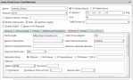


 窥视卡
窥视卡 雷达卡
雷达卡 发表于 2017-6-22 10:13:51
 提升卡
提升卡 置顶卡
置顶卡 沉默卡
沉默卡 喧嚣卡
喧嚣卡 变色卡
变色卡 千斤顶
千斤顶 显身卡
显身卡